
Unless someone is living under a rock, everybody recognizes Apple. Apple is one of the most valuable and iconic brands globally. Apple, Inc. uses the Apple brand to compete across many competitive markets. These markets include the computer industry with its Macintosh (iMac) line of computers, the smartphone industry with its iPhone, the digital music distribution with its iTunes music store, the consumer electronics industry via the iPod and the iPad, games and applications with its App Store for the iPhone and iPad, digital payments through its Apple Pay, and movie and TV content distribution through its Apple TV. V.
Apple, Inc. has indeed come a long way since its days as the Apple Computer Company in the 1970s. When it comes to blazing trails, Apple is at the forefront of it. The company’s product strategy involves creating innovative products and services in line with the “digital hub” strategy. The Macintosh computer products serve as a digital hub for digital devices, including the iPod, PDAs, and cell phones, and smartphones.
Now, the full impact of a quite well-thought-out brand strategy has arrived into focus – and one in which customer experience is the key: the Mac is no longer all things Apple. Today, Apple offers a harmonized, synchronized, and integrated user experience across all of its chief devices – the iPhone, iMac, and iPad – using the iCloud as the hub. Apple is in the process of expanding this experience outside the Apple-dominated environment by introducing deep integration with Facebook and Twitter on iPhone, iPad, and iMac.
The core of Apple’s competence is offering and delivering exceptional experience with its superb user interfaces. Its product strategy is based on this, with the iTunes, iPhone (with its touchscreen capabilities also used on the iPad) and App Store playing key roles.
Apple’s branding strategy to learn from – using emotion to sell products and services
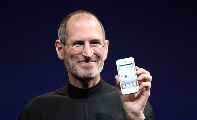
If you’re looking for an inspirational branding success story, you have to look at Apple. Founded by college dropouts Steve Jobs and Steve Wozniak, its pioneering expansion into various industries and new services such as iTunes and Apple Pay helped propel Apple into becoming the first $700-billion company in the US.
Probably the most significant factor of Apple’s iconic branding strategy is taking advantage of the customer’s emotions, bolstered by a forward-thinking creative visionary, Steve Jobs, at the helm. Since its establishment in 1976, Apple has prioritized building a community of loyal and dedicated fans in an almost cult-like fashion.
One of Apple’s secrets of its success is keeping an aura of secrecy surrounding the inner workings of its brand. And this is why every time a new iPhone is released, the hype surrounding it is unrivaled, fueling conversations among techies and non-techies alike.
Apple has always positioned itself as a trailblazing company – a company that’s different and outstanding from the rest. That’s why Apple says, “Think different.” Unlike other tech companies, what the products actually do is not what brings in big sales for Apple.
For example, consumers don’t think: “I will buy this phone because it’s has a dual SIM capability with octa-core processing, 64GB of storage, and a 12-megapixel camera.” Instead, they think: “I will buy this phone because it’s an Apple iPhone.”
Apple’s air of premium exclusivity when promoting new product releases, and its precise and meticulous attention to aesthetic detail of their products, has enabled the company to be associated with “high-end” or “luxury” in the eyes of its loyal customers. And that is what Apple fans are paying for a premium for: a status symbol driven by emotion, not logic or practicality.
No matter how creative, exciting, or entertaining your brand campaign is, if you have no emotional connection with your audience, it’s likely that your marketing will miss its mark.
It is the emotional connection that has developed such brand loyalty among Apple loyalists. In addition, it has enabled Apple to get away with the high pricing of its products.
Apple’s logo throughout the years
It all started with a fruit.
In a 1981 press conference, a journalist asked Steve Jobs why he chose the name Apple. To this question, he replied, “I love apples and I like to eat them. But the main idea behind Apple is bringing simplicity to the public, with the most sophisticated way, and that’s it, nothing else.” Then he added, “The fruit of creation. Apple. It was simple but strong.”
Jobs later talked about where he got the inspiration for the company’s name. It was from his visit to an apple orchard while on a fruitarian diet. He thought the name “Apple” was “fun, spirited, and not intimidating.”
First logo (1976 – 1977)
![]() Despite carrying the name “Apple,” the company’s first logo did not describe the shape of an apple, although there’s an apple in it.
Despite carrying the name “Apple,” the company’s first logo did not describe the shape of an apple, although there’s an apple in it.
The first logo, designed by Ron Wayne, depicts famed physicist Sir Isaac Newton sitting under an apple tree. Newton was known for his discovery of gravity. Legend has it that the young Newton was sitting under an apple tree when the fruit fell and hit his head. It was the “Aha!” moment that prompted him to suddenly come up with his law of gravity.
A line by the Romantic-era English poet William Wordsworth is written on the frame in the logo: “Newton… a mind forever voyaging through strange seas of thought.”
It’s reasonable why the logo did not last very long. It looked too old-fashioned and was particularly difficult to reproduce a small-sized image. Jobs also believed that the logo was judged to be in harmony with the modern Apple computers that impressed.
Second logo (1977 – 1998)
![]() Apple hired designer Rob Janoff to create the now-familiar silhouette of the bitten apple. Janoff presented Jobs with several monochromatic themes of the bitten apple logo. While Jobs loved the design, he insisted that it be colorized to make the company more accessible to the public and signify that Apple could generate graphics in color.
Apple hired designer Rob Janoff to create the now-familiar silhouette of the bitten apple. Janoff presented Jobs with several monochromatic themes of the bitten apple logo. While Jobs loved the design, he insisted that it be colorized to make the company more accessible to the public and signify that Apple could generate graphics in color.
Many people assume that “bite” in the Apple logo is a pun for “byte,” a computer term that is a fitting reference for a tech company. But the real reason why it was designed with a bite is that it won’t look like a cherry.
The “rainbow apple” logo lasted for 21 years, becoming Apple’s most enduring logo thus far.
Third logo (1998 – 2003)
![]() A year after introducing the iMac G3, which became a big hit due to the variety of “candy colors” in its models, Apple officially dropped the “rainbow apple” logo in favor of a monochromatic scheme. But the company still retained the bitten apple silhouette.
A year after introducing the iMac G3, which became a big hit due to the variety of “candy colors” in its models, Apple officially dropped the “rainbow apple” logo in favor of a monochromatic scheme. But the company still retained the bitten apple silhouette.
The logo has a metallic look with embossing, which Apple has applied to many of its products.
Jobs and Wozniak were fans of the Beatles. However, the Apple Inc. name and logo encountered trademark issues with the Apple Corps., Ltd., a multi-media company founded by the Beatles in 1968. It resulted in a series of lawsuits and tension between the two companies, eventually ending with a settlement in 2007.
Today, Apple uses a more updated “minimal” Apple logo in three colors: silver, white, and black.
Fourth logo
![]() The fourth Apple logo retains the bitten apple shape, but this time, in all-black color. First introduced in 1999, this logo was used until late 2000, predominantly on hardware. However, it still appears on some Apple products.
The fourth Apple logo retains the bitten apple shape, but this time, in all-black color. First introduced in 1999, this logo was used until late 2000, predominantly on hardware. However, it still appears on some Apple products.
The millennial Apple logo is one of the sleekest and most recognizable, just as famous as (or maybe even more than) the Nike tick or the McDonald’s golden arches. Steve Jobs’ decision to hire Janoff and choose a minimalist-style logo – which may have fueled the “flat” logo craze – was another stroke of genius by the enigmatic late founder.