For most businesses, a logo is an essential part of their branding – it’s the visual shortcut to the brand’s trademark. A logo can either make or break a business. However, A well-designed logo creates a strong impression on the consumers and enables them to identify the company more easily. It also makes any company stand out from the competition and fosters brand loyalty.
Most of us identify Microsoft, one of the largest tech companies and most powerful brands in the world today, through its iconic four-square “window.” But did you know that Microsoft’s current logo is a far cry from its earlier versions? The updated design represents Microsoft’s logo evolution over the decades.
If you reached Microsoft during its early years, you have witnessed its progress and evolution from its establishment to its present status as one of the world’s global tech giants. With the technology itself evolving at a rapid pace, businesses in that industry must keep up with that pace, too. Microsoft’s evolution as a company can also be seen in its logos. Let’s see how it has updated its logos over the years.
Traf-O-Data logo (1972 – 1975)
Microsoft’s predecessor, Traf-O-Data, was a business partnership between Bill Gates, Paul Allen, and Paul Gilbert in 1972. It specialized in traffic counter and traffic light computer technology. The company proved to be short-lived but laid the foundations for the creation of Microsoft Corporation in 1975.
Until 1987, the Microsoft logotype had undergone three major redesigns, which began with Traf-O-Data’s logo.
The logo, created in 1972, featured a unique and quite clever design, consisting of three black figures, forming somewhat a stylized monogram “D.” The circle in the middle stood for the letter “o” and the left bar of the “D” was designed to look like “T,” so the entire emblem could be read as “ToD,” an abbreviation of the company’s name.
Microsoft’s first logo (1975 – 1980)
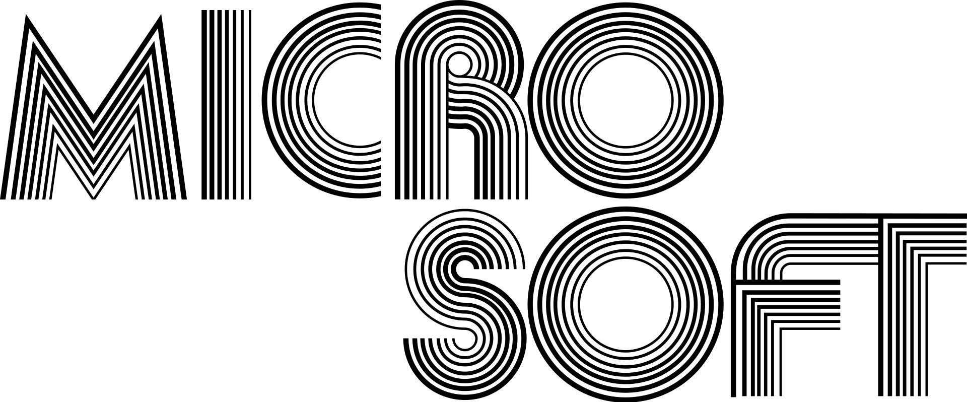
Following the dissolution of Traf-O-Data was the establishment of Microsoft in 1975. Traf-O-Data’s and now Microsoft’s founders, Gates and Allen, were behind the creation of Microsoft’s first official logo. It features a monochrome main theme and a typical sans serif typeface representing the 1970s and the Disco era. It is also the only Microsoft logo with two lines.
Microsoft’s second logo (1980 – 1982)
Microsoft ushered in the new decade with a new font, which is decidedly different from its earlier “Disco” logo. The new logo maintained the monochrome main theme, but this time, the typeface looked sharper, aggressive, and more modern. For the sharp look, Microsoft used angular lines, replacing the rounder font of the company’s first logo. The font used for this logo is New Zelek.
The new emblem seemed to be directly inspired by the heavy metal bands of the 1980s. Plus, the name of the company was now written in one line, as opposed to the two lines of the first logo. The “M,” “R,” and “F” extend from the frame, strongly resembling Metallica’s logo.
The logo stayed with the company for only two years.
Microsoft’s third logo (1982 – 1987)
In 1982, Microsoft moved away from its “rocker” side to create a more formal, corporate look. This time, the logo was written in a much simpler sans serif. It also kept its monochrome main theme. The letter “O” was accented with horizontal lines, making it look like a CD; the “O” was also used alone as the company’s logo.
Microsoft employees apparently loved the new logo and gave an affectionate nickname for it: “Blibbet.” They loved it so much that they even petitioned to keep it during the 1987 redesign.
Microsoft’s fourth logo (1987 – 2011)
The “Blibbet” logo was retired in favor of the new logo, known as the “Pac-Man.” It is named as such because of the mouth-like slash cut into the side, resembling Pac-Man’s iconic chomper.
The font used for this emblem is Helvetica Black Italic. The triangular white cut on the “O” aimed to separate “Micro” from “soft,” making people look at the company’s name under the new angle.
This logo was used for more than 20 years, making it the most enduring Microsoft logo so far. It had a slight modification in 2011. But other than that, the “Pac Man” logo was virtually unchanged during its existence.
Microsoft’s fifth logo (2012 – present)
In 2012, Microsoft underwent a major rebranding of its corporate visual identity. The new logo features a geometric icon that consists of four small colorful squares that form a window, which is a reference to the Windows operating system – one of Microsoft’s biggest and most important products.
The bold and italic fonts of the past logos were replaced by a much simpler Segoe Semibold sans serif typeface in light gray. However, the addition of a colorful icon makes the current logo unique from its predecessors. According to some people, the colorful “window” represents the Microsoft Office suite – red for MS PowerPoint, green for MS Excel, blue for MS Word, and yellow for MS Outlook. Others see the window symbol as another representation of Microsoft’s other products and applications.
Do you think the current logo is here to stay, or will Microsoft update it very soon? Will it outlast the “Pac Man” logo, or will the latter remain the most enduring logo in Microsoft’s history? There are so many questions. But only time, trends, corporate decisions, or any of these factors can dictate Microsoft to rebrand itself and revamp its logo.
Conclusion
If you happen to own a new business and are thinking of a new logo right now, why not ask your friends, colleagues, or employees for help when creating it? They will certainly give you a hand or provide you with constructive feedback. As you may have seen in this article, it’s almost tempting to follow trends.
There’s nothing wrong with following the latest trends as a design inspiration for your new business logo. However, it’s always better to choose something unique and timeless. Create a logo that makes a strong, solid, and enduring impression on the consumers and separates your brand from the competition.


