

Headquartered in Austin, Texas, Tesla, Inc. is a multinational company that specializes in automotive and clean energy solutions. Tesla is a pioneering company specializing in creating and producing electric vehicles, including cars and trucks. Additionally, they offer a range of products and services that cater to battery energy storage, from home to grid-scale, as well as solar panels and solar roof tiles. Tesla is one of the most esteemed corporations globally, having earned its place as the world’s most valuable automaker since 2023. By the year 2022, the company had achieved an impressive feat by securing the highest global sales of battery electric vehicles, thereby claiming a significant 18% share of the market. Tesla Energy, a subsidiary of the company, is a prominent developer and installer of photovoltaic systems in the United States. Tesla Energy ranks among the leading providers of battery energy storage systems worldwide, boasting an impressive installation of 6.5 gigawatt-hours (GWh) in 2022.
The Tesla logo instantly symbolises the electric vehicle manufacturer and its commitment to innovation and sustainability. This emblem has become synonymous with the brand and is easily recognized by car enthusiasts and casual observers. But how did this iconic logo come to be? Let’s take a closer look at the history of the Tesla logo.
The Creation of Tesla
Martin Eberhard and Marc Tarpenning created Tesla Motors in California on July 1, 2003. They named the brand after Nikola Tesla, an inventor and electrical engineer best known for his work on alternating current. The original purpose of Tesla was to leverage Nikola Tesla’s discoveries to create 100% electric sports automobiles. If the first automobile saw the light of day, it was thanks to a lot of outside funding, particularly that of Elon Musk, who became CEO of Tesla in 2008. Tesla’s first car, the Roadster, was released the same year.
The Creation of the Tesla Logo
Since its establishment in 2003, Tesla’s brand image has remained relatively constant. RO Studio is the creative force behind the iconic Tesla logo. The agency has gained recognition for its exceptional work on the SpaceX brand, owned by the renowned entrepreneur Elon Musk. The company is a specialist in the field of space flight and astronautics.
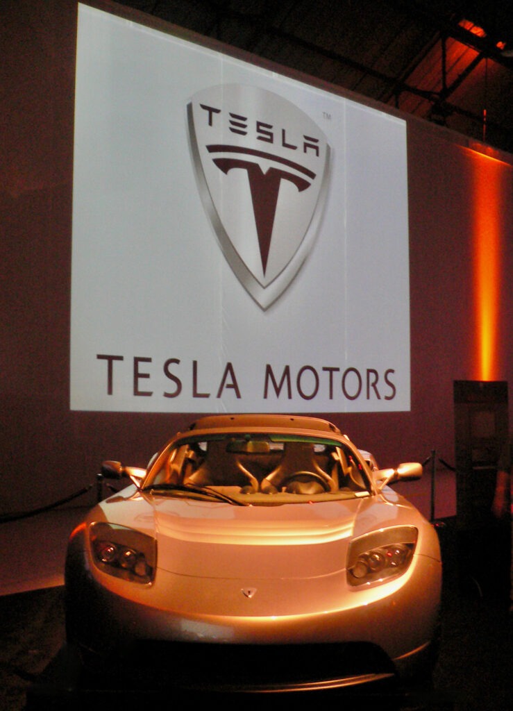
The first logo of Tesla was comprised of two distinct elements: the company’s moniker; and a shield bearing an emblem in the form of the letter T, symbolizing the brand’s appellation. The logo was a combination mark, although it was designed in such a way that the emblem could also be utilized independently. Tesla presented a sleek and forward-thinking symbol featuring a three-dimensional effect on the shield, a widely used design element in logos of the preceding decade. Emblem D was the name of the font adorning the shield, and it was destined to be repurposed for subsequent iterations. In certain emblem variations, the Tesla logo was rendered in a striking shade of red.
The Tesla logo represents a cross-section of an electric motor. The Tesla logo is a unique, futuristic depiction of the letter “T.” It features a white symbol against a black or red background. The Tesla logo was originally intended to fit under a shield symbol, but the company eventually ditched it and chose the letter “T” as its mark. The main body of the “T” represents one of the motor’s rotor poles, while the second line on top represents a stator component. It reasonably approximates an electric-motor cross-section by repeating the Tesla logo in a circle, with the top of each “T” facing outward.
Nikola Tesla continues to be the company’s principal inspiration. This is one of the brand’s characteristics that has helped the corporation build a strong brand image and differentiate itself from other automobile manufacturers over the years. In 2007, the logo underwent yet another iteration of change, including the introduction of the horizontal line that runs through the middle of the letter “T.” This was meant to be a symbol of the flow of electricity as well as a hint to the fact that the corporation places a strong emphasis on innovation and progress.
Since that time, the Tesla logo has experienced a few subtle iterations of alteration, but for the most part, it has maintained its original form. For instance, in 2013, the company logo’s color was shifted from black to silver, and in 2017, the font underwent some minor adjustments.
People from all around the world are able to recognize the Tesla logo immediately, and it has developed into a symbol that represents the company’s commitment to innovation and sustainability throughout its history.
The New Tesla Logo
![]()
In 2017, Tesla made the decision to update their company logo by including a few new elements. The business decided to drop the word Motors and take just the letter T as its primary logo and symbol of the Tesla brand name instead. The color of this T changed depending on whether it was put on a white or red background. It may be either red or silver. It is important to keep in mind that Tesla is not the only corporation that has decided in recent years to simplify its logo. Companies like Starbucks, Nissan, and Mastercard have recently redesigned their logos, and as part of those redesigns, they have deleted elements from their logos in response to the current trend toward minimalism in logo design.
Conclusion
Since the firm was established, the Tesla logo has undergone several changes, yet its message has remained the same: dedication to technological progress and environmental responsibility. It represents the company’s mission to bring about a revolution in the automobile industry and create a more environmentally friendly future. The Tesla logo is an effective expression of this aim, and it will undoubtedly continue to develop in the future as the company grows and changes.