
The manly brand Old Spice has long been a leader in men’s deodorant, and its classic logo is very recognizable. Introduced in 1937 as the Early American Old Spice, the company has reinvented the brand to appeal to a younger demographic to compete with its rival products.
Keep reading to learn more about the Old Spice logo and its font.
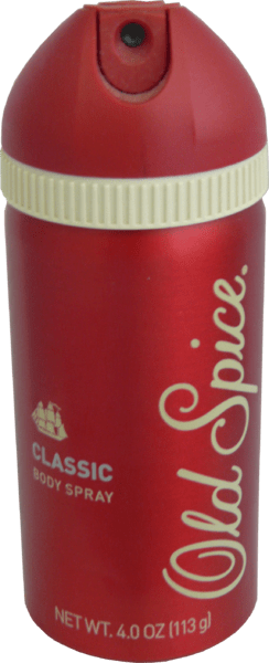
Meaning and History of the Logo
The Old Spice logo is made of a laid-back script that imitates handwriting. The brand itself was introduced in 1937 under the name Early American Old Spice. The company’s products are manufactured by Shulton Inc., a soap and toiletries company owned by William Lightfoot Schultz.
Old Spice is known as a manly brand, but its original product was aimed at women. His mother’s potpourri inspired Schultz, and as a result, the first Old Spice product was a women’s scent called the Early American Old Spice. The product was well-received, and it was followed by Old Spice for men in 1938.
The Old Spice logo has always alluded to the nautical theme. Sailing ships were used for the brand’s packaging. Why?
As we all know, Old Spice products have spicy notes. Centuries ago, spices were very expensive because they were brought by ships that sailed to distant places. So, the nautical theme, which stemmed from the spicy scent of the product, became an important trademark associated with Old Spice.
Another reason why the ship worked well as a symbol of a manly product is that being a sailor is usually a man’s job. The work required great courage and strength and involved a huge risk – all of which are traditionally associated with male qualities.
The ships used as the prototypes for the packaging design were the Grand Turk and the Friendship. Other ships that were used on old spice packaging were Salem, Birmingham, John Wesley, Maria Teresa, Recovery, Propontis, Star of the West, Hamilton, and Salem.
However, the company later dropped the colonial nautical theme and replaced the ship with a yacht. The blue yacht emblem was used on the ivory, buoy-shaped bottle in the 70s through the 90s. During that time, the popular TV ad that played featured a lone surfer riding the waves.
Later on, a new era started for the product. Procter & Gamble was trying to aim at first-time deodorant users, so they partnered with Landor to redesign and reposition their brand. Eventually, the band returned to the nautical colonial ship theme.
Old Spice Rebranding
Old Spice has long been a leader in men’s deodorant, but despite many years of success, the company had serious problems with branding after the turn of the millennium. And the brand began losing share when Axe entered the market with its raunchy campaign targeting young men. To counteract it, the company launched a daring rebranding campaign that turned out to be one of the most successful of its kind.
Before its rebrand in 2010, Old Spice was viewed as a brand aimed at older generations of men. It wasn’t bad, as it has a certain appeal to it. But over time, it became stagnant and wasn’t appealing to the younger generations. From a marketing perspective, it’s essential to reach the young demographic so a product can remain competitive on the market.
Procter & Gamble partnered with Landor to help reinvent the brand so it can appeal to younger men. It needed to shake off its reputation as a grooming product for grandpas.
When Old Spice rebranded, they didn’t hold back. It kept the name but altered almost anything else. Old Spice changed its tone of voice and positioning, taking off any sense of seriousness in its image, and the people loved it.
Old Spice’s 2010 commercial, entitled “The Man Your Man Could Smell Like,” has become the stuff of legends. It was first aired online before TV, and it became an instant hit, especially with the younger, internet-savvy generation.
The campaign featured the handsome, chisel-chested Old Spice Guy (former NFL player Isaiah Mustafa). It was launched before the 2010 Superbowl and immediately became a viral video sensation. Even if it didn’t air during that Superbowl, the ad was one of the most talked-about commercials, helping ignite the brand’s sales.
The ad featured Mustafa addressing the viewers with snappy sentences in random environments. It was weird, quirky, and humorous, allowing it to instantly generate a lot of buzz.
Because of this campaign, Old Spice’s outdated image was gone and was replaced by a witty, energetic, and humorous brand identity. The brand was able to engage with its target demographic, and its sales figures came up as its online presence skyrocketed.
The brand also had a “Man book” that articulated the principles behind the Old Spice brand. The cheeky verbal identity in the man book was extended to their ads, packaging, and in-store displays, bringing Old Spice’s celebration of masculinity to every touchpoint.
Old Spice Font
The current Old Spice logo is dark red in color and placed over a white background. It was also available in other color schemes, depending on the label of the product. Earlier, the company used a blue yacht logo.
In its famous ad featuring Isaiah Mustafa, where he was on a horse in the end, you can see contrasting typography. The phrase “Smell Like a Man, Man,” is written on a typeface from the Sans Serif family. Sans Serifs are simple, minimalist, and basic. Sans serif fonts don’t have serifs, which are small lines or strokes attached to the tips of the letters.
The second typeface in the ad is the Old Spice logo, which is from the Script family. The font is pretty fancy and old-fashioned, just like other fonts in Script typefaces where the letters swoop and look like they were handwritten. You can get the Old Spice font for free here and here.