
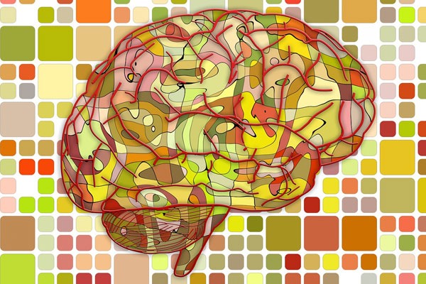
We may not notice it but colors affect our lives on a daily basis. There is an energy about them that affects us emotionally and psychologically. Color can affect our mood and our decisions. Colorcan help us convey messages without really saying anything. For example bright red definitely brings a distinct message when seeing it used in specific ways. Color provides a form of a non-verbal cue and messaging.
The power of color is so influential that most of the world’stop brands have their go-to colors that they use on their products and advertisements. These colors have been deemed successful in grabbing consumers’ attention and eliciting certain feelings and emotions.
Some interesting statics about use of colors in brands are:
- 33% use blue
- 29% use red
- 28% use black
- 13% use yellow
In the world of Web design, choosing the right color for your design plays a vital role on how consumers will react to the product or services that you are selling and promoting. Unlike the early web designs, modern web designers find that understanding the psychology of color is crucial to web design and engaging the site visitor. Color has the power to grab someone’s attention and trigger the right emotions for sales and it plays a big role in persuasion.
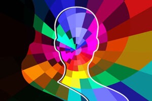 There have been many studies about linking product colors to the urge to purchase. These studies show that when we see color, there are series of reactions happening in our brains. Based on these studies, here are some of the reactions for common colors.
Red – This color promotes action, energy, and urgency. This is the reason why in most cases if we want something to be addressed right away or we want someone to notice something, we use red.
Yellow – This one suggests optimism and cheerfulness as well as cowardice and criticism. It encourages one to be analytical but also judgmental. Having too much of this color can also trigger anxiety.
Green – This is the color that makes you relax. It embarks a soothing feeling, of balance and of growth. If you notice, the color green is often used for skincare products and herbal supplements. In general it generates positive vibes.
Blue- This is probably the most popular among all colors. This color exudes trust, peace, loyalty, and integrity. It can also convey frigidity and traditionalism. Most companies opt to go for this color because it grabs attention, gives you that feeling of stability and it is also considered to be the color of truth.
White – This coveys tranquility, of cleanliness and purity. Just like the color black, this can be paired with any color. It works best when paired with dark and deep colors because it kind of neutralizes and gives the sense of balance to the logo or the photo.
Orange- This is the color of aggressiveness. It creates a call to action, to buy or sell. This also radiates the sense of adventure, of being open and social.
Pink- This gives out the feeling of kindness and tenderness and being nurturing. It is very popular to young girls because it of the reaction it generates. It is also nurturing and is considered a color of love. This color is usually used to promote and sell feminine products. This is also used to market baby and maternity products.
Black- This is a color that works with almost all of the colors. Because helps highlight the color that it is paired up with. It also conveys being powerful and sleek. This is often used to market luxury products.
Purple – Conveys calmness and is soothing to the eyes. It has a richness and a sense of luxuriousness to it that it is often used for beauty and anti-aging products.
Gray – This color is considered unemotional and neutral. The term “gray area” means you are unsure of something. It’s not black and not white but something in between. However, it also gives you a feeling of solidity and composure, like steel.
Color psychology is not an exact science as it is affected by individual perceptions. Men are influenced by different sets of colors than that of women. Before designing a website,
here are some things that you need to consider:
1. Know your product – Whether it’s retail or software or services, you have to have a clear picture of what you are selling/promoting, its objective and what you want the consumers to do when they visit your website.
2. Know your Target Market – You have to know to whom your product/services will sell the most. Will it be for women exclusively? Or just for men or for everyone?
3. Choose a Color Scheme – This is why knowing your target market is important. The colors that you will be using on your website will mostly depend on who your audience is. For example, if you are selling makeup for women, you want the website to look vibrant, full of colors and it has to bold. Often times you will see different shades of pinks, reds, and blacks. This will entice your lady consumers to really buy the products because of how fun it looks. Another thing that sells to women is the product packaging. If the packaging is fun and the color is right, you might’ve just hit a jackpot.
Designing a website for men’s formal wear on the other hand will be quite different. The website should look sleek, and composed. The color scheme should be geared toward the cool tones like blues, grays, and black. This conveys formality, gives off a certain degree of class and luxury.
Overall, the sense of the colors that you will be using must match the personality and character of your brand design. You will want to keep the colors and brand uniform and recognizable to your target consumers. Finding that right combination of color can provide a significant boost to your marketing and branding effectiveness.