
Coca-Cola is a multinational brand that transcends culture and generations. It is perhaps the only manufacturer that has experienced growing sales since its birth. Today, with almost every meal, lunch or dinner, Coca-Cola is consumed widely. Additionally, its taste is as unique and interesting as its history. However, few people are aware of it. The birth of Coca-Cola was a result of many experiments and failures, but it spread like fire once it was introduced to the public.
History
It all began in 1886, when a pharmacist by the name of John Stith Pemberton, residing at New York harbor, was trying hard to develop drugs. Unfortunately, none of his creations were able to fetch a single penny. After a lot of struggle, Pemberton decided not to waste any more time and traveled to Atlanta, where he thought giving the beverage market a try might bring something.
At first, Pemberton was unaware that struggle would follow him, but this time he was in a totally different mode. He decided not to give up. Many experiments were conducted in the coming years until he finally was able to achieve a taste not known to the world. This was in the form of a carbonated drink.
Pemberton, by now, has become a master in experimenting and blending. By blending the basics, he combined many different tastes by utilizing different products until he acquired the desired taste. It was not long until people finally noticed the product and started talking about it. For them, Coca-Cola was not only enjoyable in terms of taste but also revitalized their mood.
Coca-Cola had become a new favorite across the globe.
Asa Griggs Candler and Coca-Cola
Initially, Coca-Cola became a reason for conversations and friends hanging out. It was as simple as one friend calling another over for a drink to talk things out. Coca-Cola became a belief. If someone was depressed or worried about anything, he/she would drink it to uplift his/her mood and kick depression away. Coca-Cola was put on sale by Jacob’s Pharmacy for five cents. Frank Robinson, who was the partner of Pemberton, gave a name to the mixture ‘Coca-Cola’ and mentioned it in his idiosyncratic script.
When Coca-Cola was in its initial days, Pemberton was only selling nine glasses of Coca-Cola per day. His death brought a gentleman by the name of Asa Griggs Candler into the scene who took over the business and became the sole owner of the brand. Additionally, he became the savior of the brand.
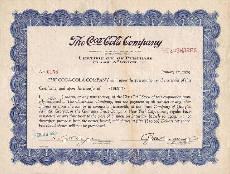
The popularity enjoyed by Coca-Cola today is the result of Asa Griggs Candler’s excellent branding and marketing tactics. Between 1888-1891, Asa Griggs, an Atlanta-based businessman, secured the right of the business for $2,300. Furthermore, Asa Griggs paid for the logos to be displayed in notepads, artworks, datebooks, and bookmarks so that the brand is able to reach a much broader customer base, more rapidly. The strategy played off, and Asa Griggs became the first president of the brand. By now, Coca-Cola was a name on everyone’s tongue.
The historical years, 1887-1893
Coca-Cola had settled itself amongst customers for a while now. It had successfully captured a huge customer segment and was continuing to do so. However, John had decided that the brand should have a logo as well. This logo would serve as the identity of the brand. Then again, John turned himself towards Frank Robinson, who was a trustworthy friend and knew typography.
Frank, by utilizing his excellent penmanship skills, was able to pull off the first script logo design of Coca-Cola. However, experts in this field were quickly able to point out that the logo missed a registration mark. Without the presence of the registration symbol, Coca-Cola would not have been able to declare itself a registered company and, most importantly, a registered trademark.
Of course, at this point, the logo underwent many changes and present in their unpolished forms. It was said by many that the logo of Coca-Cola was designed without using any modern tools. The logo of Coca-Cola featured a rough look and required several changes. Then, in 1891, the trading card resulted in the reversing of the logo and showed much more details in the first logo.
By 1892, the logo has experienced a bit of a makeover, but it still needed alterations, variations, and changes. At the moment, the logo was only reversed to adjust variations using typefaces and diamonds.
The years between 1893 and 1904 were probably the biggest breakthrough years for the brand. Coca-Cola was able to secure its very first trademark from the patent office. This made the brand official. After it had become official, the logo was detailed, and now the trademark symbol had appeared beneath the name.
1903-1941, The Official Registration Years
In 1903, after Coca-Cola has officially registered itself, the Trademark Registered logo began to appear under the capital letter “C.” This was basically the requirement of a new law that required the corporations to re-register their trademarks. As a result, the middle of the year 1920 saw the word ‘Drink’ appear in logo design as well.
Then in 1941, it was declared that the addition of REG. U.S. PAT.OFF is mandatory and should be included in the trademark logo as well. However, this time Coca-Cola was asked to give up its capital letter ‘C’ and place it in the center to make it COCA-COLA.
The Famous Coca-Cola Bottle
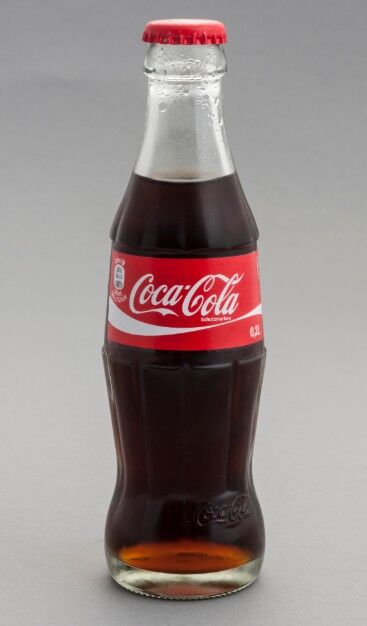
When the Coca-Cola bottle came out with its iconic fluted lines, it was a huge success. Furthermore, it is one of the best-shaped bottles in the world today. Raymond Loewy, who was the designer of the Shell logo, described the design as the ‘Perfect liquid wrapper.’ Moreso, the bottle became a part of many worldwide celebrations, art music, and advertising.
The bottle’s influence was such that when German automaker Volkswagen wanted to celebrate the Beatle’s shape, it compared it with the bottle.
The famous Coca-Cola bottle also resulted in a cooperative project between the company and the bottlers. Soon, Coca-Cola sought rights to its bottle. After it had successfully achieved the rights, many competitors tried to copy the design in order to deceive the public but in no vain. Coca-Cola was a giant, and the competitors had no chance.
1950, The Year of Simplification
At the beginning of 1950, designers focused on carefully observing the logo and finding out the complexity. The designers were trying to give the logo a simple look, incorporating all the trademark symbols. As a result, the designers were able to place the trademarked term beneath the name and began using it on some items.
During the 1950s, consumers were looking at a brand new logo, with the name ‘COCA-COLA’ inside a huge red circle. Furthermore, the new iconic bottle was also displayed alongside it. The word ‘Always’ was also added in the curve above the logo. This was the only addition made to the already existing logo but made a huge difference.
2002-2007, The Energetic Ribbon Era
In 2002, Coca-Cola added a slight twist to the logo, but it kept the vintage vibes intact. By now, everyone was aware that Coca-Cola was slowly but gradually moving towards its goal and trying to achieve the finest logo. Furthermore, Coca-Cola was not in a hurry. It was already selling in mammoth numbers across the globe, and sales were not an issue. Therefore, it was taking things low and slow.
Coca-Cola added a ribbon underneath the brand name, and it too began appearing on every item. However, it was different in different countries. The addition of ribbon was actually an innovative way for Coca-Cola to communicate its shift from the long-held red and white palette.
Coca-Cola today
Coca-Cola came up with its final version of the logo in 2009. The brand had given up on its emblems and catchphrases etc. for a ribbon, script, and a modest representation of the trademark.
Furthermore, the year 2009 was the same year when the evolution of the logo came to an end. John Stith Pemberton passed away in 1888 due to stomach cancer, but one could see the progress Coca-Cola had made just by making slight additions to its original logo.
The logo remains the same as Coca-Cola does not plan to make significant changes in the near future. The reason is that the current logo is enough to communicate the message of Coca-Cola to its customers.
Final Word
Coca-Cola has successfully differentiated itself from its competitors by communicating a short tagline “open happiness.” Coca-Cola’s idea of happiness inside a bottle had greatly caught up with the world and was appropriate for the brand’s essence.