
Many of us like to believe that we are unaffected by branding and advertising. However, with the vast quantity of messages we receive through various media formats throughout the day, it is almost impossible to completely avoid coming into contact with one brand or another. Ensuring that their message is effectively communicated to a certain demographic or target market is one of the primary goals of a brand, and in such a competitive environment every effort is made to utilize any factor that may result in an advantage being gained.
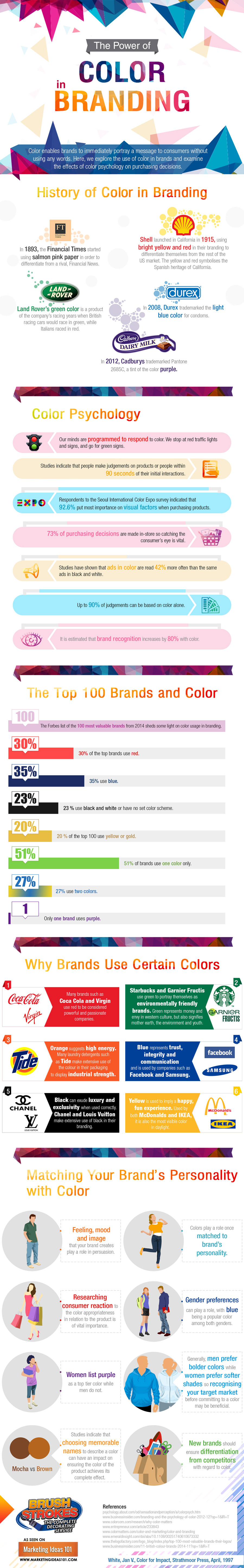
This infographic by Brushstrokes is aimed at increasing awareness of the importance of color in branding, and how our decisions can be influenced by colour. For example, studies have indicated that purple is a colour that is generally more attractive to females. Therefore a masculine brand would rarely use this. We hope to inform brand owners, and potential brand owners, on how to match brand personality with color, as well as educating readers about why certain brands use certain colors.
What are logos are you drawn to? Do you have any tendencies to favor one color over another? Share your experience in the comments below!
Click here to view an enlarged version of this infographic.
Embed This Image On Your Site (copy code below):