
The Hoover logo is one of the most iconic logos in history. It has been around for over 100 years and has undergone many changes over time. In this blog post, we will take a look at the different versions of the Hoover logo and discuss why it changed over time. We will also take a look at how the Hoover brand has evolved over the years.
What is Hoover?
If you have a heart for cleaning your house, you might already know what Hoover is. The Hoover Company, popularly known as Hoover, is a brand that focuses on producing and marketing various home appliances. However, this brand was popularized by its floor care products – mainly its vacuum cleaners. Hoover vacuum cleaners have been around for more than a hundred years, and their quality is still top-notch.
Interestingly, Hoover became known not only for its incredible vacuum cleaners but also for its simple logo. You can commonly identify Hoover’s logo for its distinct font, enclosed in a red circle. And as mentioned earlier, this logo has been one of the most iconic around the world and lasted many years.
However, the Hoover logo underwent various changes over the years. The changes made were quite simple and did not make a huge impact on the brand.
Changes to the Hoover Logo
Henry Dreyfuss is one of the pioneer designers and inventors that made significant development to the Hoover brand. Besides developing the early Hoover vacuum cleaners, Dreyfuss is also responsible for designing the company logo, which is still popular today.
Dreyfuss’ design for the Hoover logo showcases a red roundel consisting of the word “Hoover” enclosed in white and red trim. The brand logo was introduced to the public in the 1950s, which instantly caught the attention of many Hoover fans.
However, the brand decided to make a few changes to its logo over the years. Although there are no major on the logo, the minor differences still add an interesting touch to the Hoover brand.
In 1968, the Hoover logo had a unique look, replacing the red circle with an ellipse. The elliptical shape made the Hoover logo much longer and gave it a classic appearance. Also, this variation had a 3D effect in it.
In 1999, Hoover decided to go back to the original circle shape with a darker shade. The 3D effect was also removed, making the logo look flat again. The font used for the word “Hoover” was also changed, making it look much bolder than before. This 1999 redesign is the current logo of Hoover and continues to give the brand a simple and fascinating appearance.
The current Hoover logo is almost similar to the original one designed by Dreyfuss. The main difference is the shade of red used, which is now darker than before. The font used for the word “Hoover” is also different, although it still uses a similar typeface.
Why did Hoover Change its Logo?
So why did Hoover change its logo over time? There are many reasons why companies decide to change their logos. For example, some companies want to refresh their image and appeal to a new generation of customers. Others want to update their branding to reflect their growth and expansion.
It is likely that Hoover changed its logo for all of these reasons. As a company that has been around for over a century, Hoover has seen many changes in the world. The company has also grown significantly, expanding its product line beyond vacuum cleaners.
By changing its logo, Hoover is able to update its image and appeal to a new generation of customers. At the same time, the changes made to the logo reflect the company’s growth and expansion.
Moreover, the changes made to the Hoover logo are quite minor. The company has not made any major changes that would drastically alter the appearance of the logo.
Hoover’s logo has undergone some minor changes over the years. These changes reflect the company’s growth and expansion while also updating its image to appeal to a new generation of customers. Despite these changes, the Hoover logo remains one of the most iconic and recognizable logos in the world.
Various Hoover Products
Now that you know all about the company’s origin let’s look into the various products that benefited from its remarkable logo.
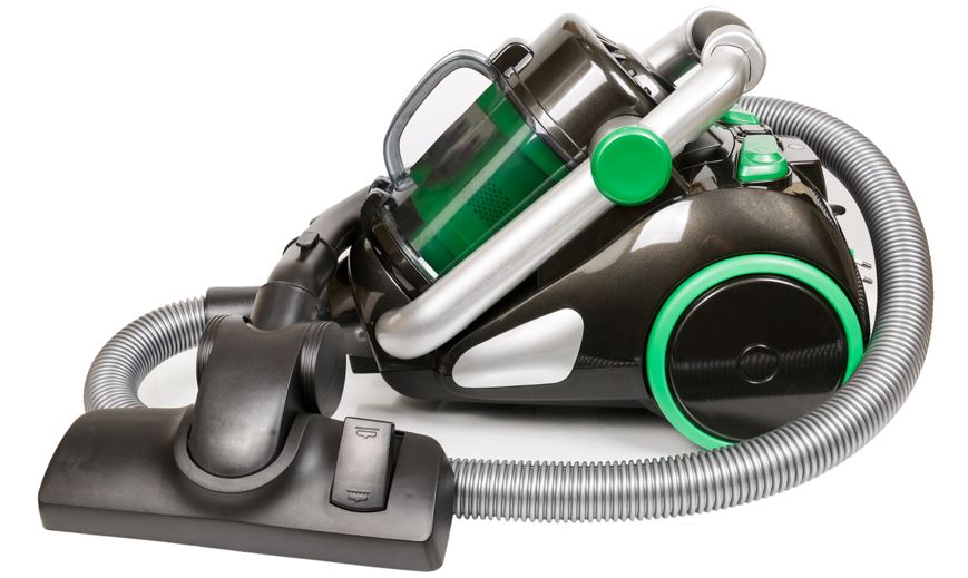
The first product that used the Hoover logo was the vacuum cleaner. As mentioned earlier, Hoover is one of the most famous brands when it comes to vacuums. The company has been making vacuum cleaners for over a century, and its products are still some of the best in the market.
In addition to vacuum cleaners, Hoover also manufactures other floor care products such as carpet cleaners and hard floor cleaners. These products are also very popular among customers and have helped Hoover maintain its position as a leading home appliance brand.
Hoover also makes other appliances such as air purifiers, humidifiers, and dehumidifiers. These products are not as popular as their vacuums and floor care products, but they still play an important role in the company’s product line.
Final Thoughts
The Hoover logo is one of the most iconic and recognizable logos in the world. It has been used on a wide range of products, from vacuum cleaners to air purifiers. The logo has also undergone several changes over the years, reflecting the growth and expansion of the Hoover brand.
Whether you’re a fan of the original logo or the current one, there’s no denying that the Hoover logo is an important part of the company’s history.