
Introduction
Tyson Foods is the world’s largest processor and marketer of chicken, beef, and pork. The company has been around since 1935, but it wasn’t until the early 2000s that they developed a new logo. Tyson Foods has been led by Don Tyson since 1967, with his son John taking over in the early 2000s. Since then, the company has had several different logos used on its products. Let’s go through some of Tyson Foods’ logos from over the years and how they have changed over time.
A Brief History of Tyson Foods Company
Tyson Foods was founded in the mid-1930s by John W. Tyson in Springdale, Arkansas, as a one-man operation selling chickens door to door. As the company grew, it began raising hogs and turkeys as well as chickens. In 1966, Don Tyson took over management of the company from his father, John Tyson, who died in a terrible automobile-train accident.
By the end of 1989, Tyson Foods had become the largest poultry producer in America and began to expand internationally by opening plants in Mexico and Japan. Tyson Foods has undergone tremendous growth despite the struggling economic situation in the early 1980s.
In 1991, they started to trade in foreign markets, including that of Asia, Central America, South America, the Caribbean, and the Pacific Rim. By 1991, their international sales offices included Japan, Hong Kong, Singapore, and Canada.
When Tyson Foods’ Springdale headquarters opened in 2007, it included the Discovery Center. The Discovery Center serves as a hub of innovation for the company, industry, and consumers. It is designed to facilitate creativity and encourage collaboration with the goal of developing new products and services.
In 2021, Donnie King was named president and chief executive officer of Tyson Foods. Donnie has over 3 decades of experience in the protein business, having held a variety of executive leadership positions within the company.
Now, let’s discuss the history of the Tyson Logo.
The Original Tyson Brand Logo 1935 – 1964
![]()
In the earlier logos, the word “TYSON’S” was set in large, clean letters providing excellent legibility. The lettering “Feed & Hatchery” was smaller and was set in a slightly different type with a black background.
The Blue Oval – the 1960s
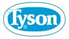
The second official Tyson Foods logo was designed in the 1960s and is similar to the current logo. The oval logo was designed by Buddy Wray, former Tyson Foods president, and COO.
The logo for Tyson Foods Inc. can be seen in a variety of forms, some with a red oval and some with a red circle. In some versions, the blue oval has decorative wavy trim.
Tyson’s Pride – 1967 – 1972
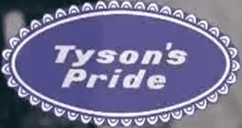
The later version of the Tyson’s Pride logo had a lace-like touch. The letters were italic and lighter. It is unlikely that this approach worked better than the more straightforward previous one.
Big Red – 1972
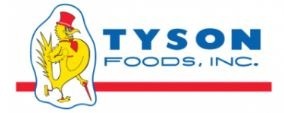
In this version, the logo has a blue, block-style font that reads “Tyson” across the top and “Foods, Inc.” below it in a lighter type. The company’s name appears in all capital letters, but its location on the logo varies. Sometimes it appeared at the very top of the design, and other times it sat directly beneath the company’s name.
Besides the lettering, the logo also had a yellow rooster mascot wearing a red hat and holding a red stick.
A Bolder Look – 1995
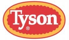
In 1995, the Tyson logo was redesigned to strengthen the company’s colors and make the image bolder. The old logo had an orange background, but it was not easy to read and looked a bit “washed out” on television.
A Final Update to the Tyson Brand Logo Took Place In 2005
Tyson’s logo has gone through several iterations, with the most recent update occurring in 2005. In this final update, the logo was made more readable so it can easily be recognized by the consumers at a glance. The new logo had a red background to make “Tyson” look bold and clearly visible.
2017 – Present
The consumer brand recently introduced a new corporate logo design to attract more corporate clients. The new design features a dark blue “T” inside a circle, with an arrow pointing right.
Tyson Foods Today
Tyson Foods is a giant in the world of food. They employ over 120,000 people in more than 100 countries and own dozens of well-known brands, including Sara Lee, Jimmy Dean, Ball Park and Hillshire Farms. Like many companies that have been around for decades, their logo has changed throughout the years.
Conclusion
For more than 80 years, Tyson Foods has been working hard to become the nation’s leading food company. As an innovative company that consistently creates new products, offers better services, and expands operations, Tyson certainly has seen its fair share of evolution.
Over the years, Tyson Foods has evolved from a poultry processor to full-line food. Although their logo has undergone some modifications over the past few years, the basic design is still used today. Being a big brand, Tyson Foods knows the great importance of logos in marketing. Today, their classic logo is practically recognized and associated with Tyson Foods by everyone.