
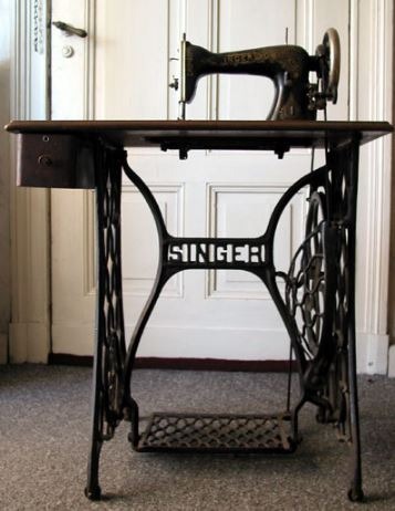
When it comes to the best sewing machine brands, Singer is what comes to mind. What began as I. M. Singer & Co. in 1851, is Singer Corporation today. Over the years, not only has the brand continuously improved and evolved its products but also the logos to represent growth.
Today, the brand along with its logo continues to highlight the role of women and their relationship to the home. So, let’s take the discussion further and try to find out how the company managed to maintain its recognition amongst all the changes. (92 words)
Timeline
1851
![]()
The first logo of the brand was designed in 1851 and used for many years. Basically, it was a combination of a monochrome image of a lady who is sitting on a chair, busy sewing at the table and a letter ‘S’ placed over the image. “Singer Sewing Machines” is visible on the letter S.
It was a detailed logo that clearly defined the brand purpose through the image of a lady and machine. On the other side, the bright red symbol S represents the name of the brand along with written material on it in white color. It was considered a very professional, complete and modern logo at that time.
1872
After many years, the logo makers needed to change it for some reason. This time letter S was given an orangish shade with white printed “Singer Sewing Machines” and the lady was changed as in this logo, the lady seems wearing a long-closed dress and was given a whole grey color.
Two small flower designs were used around both ends of the word “Sewing”. This new design was used on the front page of the pamphlet created by the company.
1874
The new logo was totally in black and white colors. A beautiful girl was shown having a long pretty curly hairstyle and busy with the machine. Letter S had a previous graphic design but without colors. This was a colorless logo designed for Singer machine’s brand.
1891
This logo was also in black and white shades but here the printed lady was in a black dress, serious looks and tied hair. Letter S and it’s over-placed content had a black outline and bold design. It was used on a sales brochure for Singer machines.
For the first time in 1891, the word Singer was replaced with “Singer’s”. They used Singer’s Sewing Machines over the letter S, unlike previous logos.
1870
The dull green background was used in the logo and ‘S’ was given reddish to orange shades with black printed content over it. The lady was drawn with black color ink on the greenish background. This logo was used around 1870 to 1920.
1904
The logo created this time was different as the lady was faced towards the audience rather than the machine. Her neckline and hair were designed as per modern trends of that time. This logo was placed on the back of the Singer 24/7 manual. The only black color was used to design the logo on colored paper.
1909
In this logo, bright red color was used for ‘S’ and white for the name of the brand mentioned over the letter. The smiling lady was printed in grey ink and looked very modern as she had small hair and a bow on the shirt. Trademark was also used in the logo.
Another colorful bright logo was designed in the same era as S was printed in shocking pink color with white content over it. Lady had a light grey dress and brown hair. She was shown stitching a white piece of cloth through the Singer machine.
1925
This logo was designed and used for many years i.e. about 27 years. A sharp red color was used to design the letter ‘S’ and simple “Single Sewing Machines” was written over the letter. The size of the trademark was reduced in this logo.
The lady was shown as busy with her stitching. She was given a medium greyish tone.
Her dress was different from previous dresses represented by designers as her V-shaped neck design and quarter sleeves make it more comfortable and weary than previous dresses.
1927
This time the logo had a very different approach as a colored globe design was used behind the emblem to present the international power of the brand. After horizontal branding, The Singer brand represented this through its logo. They printed “The Sign of Singer Services Throughout the World”
The lady was wearing a bright green shirt with a white collar and dark brown lower wear. Her hair was black in a bob haircut style. She was displayed as busy with her stitching work. Simple style ‘S’ letter and the white over-printed brand name were placed over the globe.
1929
In this period, a colorless and colorful logo was designed. The sewing machine had a potted motor and the lady was wearing a collared shirt. Black ink was used to create the logo only. Again the lady was working on the machine and ‘S’ with an overlap brand name was designed.
The second logo just had the same previous graphics with the difference of color scheme. Here the olive green background had a lady printed on it with black ink and the letter ‘S’ was colored with bright orange color. The brand name was printed in black color over the letter.
No Singer lady
A logo was also designed for the Singer Company that excluded the Singer lady. This logo consisted of bright red Singer’s ‘S’ with white content over it. The background was gold and green. The S was used on sewing thread provided by John Dewhurst & Sons. First time Singer’s lady was not part of the design.
1938
Again the lady was included in the logo but this lady was more liberal than previous ones. She wore a round collared neck with a medium-length frock. Her legs were clearly visible with her cot shoes. Singer’s S had a simple design and black color was used for the brand’s name over the letter S.
Another logo was introduced by the company in the same period after the previous simple logo. This logo had a dull green background and the same previous graphics printed over it. Letter S was given an orange color and the place name was in black color.
The third logo of the same design was created in the era but had some sharp colors as compared to the previously designed one. It had a sharp olive green shade in the background and dark orange was selected for Singer’s S. A black outline around the S was very visible in this logo.
1951
This logo was very special as it was designed for the occasion of the 100th anniversary of the company. In 1951, Singer completed its century of serving people all over the world.
In this logo, the old emblem was added with a rounded cover on which “Over a Century of Sewing Machines” was printed. Here black color was chosen for Singer’s S and white for the brand name over it. Singer’s S was covered with a globe symbol and some leaves were used under the circle covering.
1958
This logo was designed differently from the trend that was being practiced since the first one. Letter S had red color and white color was given to the brand name in this logo. This logo had been used for a whole decade.
In this logo, the direction of the lady was towards the left side of the audience, unlike the previous style. Features of the lady were not visible, only a sketch having green color was used to represent the lady. The prominent thing about her was that the machine she was using was an electronic one.
The second logo of the same graphics was created in a very colorful design. The lady was colored in white with a sea-green background. Singer S was colored in bright orange and white text over it.
The third logo of the same era was colored differently with the same basic design. Lady was printed in navy blue shade and grey background color was used in that logo. Different color schemes were experienced by the company to make more inspiring and attention-catching logos.
Another logo was also having the same graphic design but the background used for this one was off-white to light skin shade while Singer’s lady and symbolic S had dark peachy color. Text inside the S was also in an off-white shade. This was the most elegant logo among all other colors.
2001
In 2001, Singer completed its one and a half-century so again a special logo was designed. The bright yellow background was used to represent excitement. A circle was drawn with a black outline and text in it. Digits were written as 5 of 150 seemed like S that showed Singer’s S.
The singer was printed at the top of the circle in bright red color. Words lime Anniversary, 2001 and 1851 were written in black color in a circular direction along with the circle. The 150th anniversary’s logo was more modern and professional.
Current logo
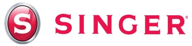
The current logo of Singer Corporation is entirely different in graphics than its historical designs. It has a slightly oval shape filled with a sharp glossy pink color. The outline of the shape has a silvery grey shade. Inside narrow outline is in black color.
The core symbol of the Singer Logo i.e. Singer’s S is in the center of oval shape. It contains a simple white tone and is written in bold and italic font. This logo is very memorable and catchy. This gives a touch of friendliness, credibility and trust from the trusted sewing machine’s brand, I mean Singer Corporation.
Conclusion
From the start to the present time, various logos were designed by the company for their consumers. According to the trends and times, designs were created and enhanced. If we compare them, present logos are more improved and catchy.
Singer Corporation covered many stages to reach where it stands now. Different color schemes are experienced to communicate with the public as per the situation. Now Singer is considered a well-known, credible and professional brand among the users.