
The 1960s is by far one of the most memorable decades in history. From Hollywood to fashion, technology, sports, and television, the 1960s pop culture trends range from being audacious, hippie to revolutionary – all contributing to the awe-inspiring period. Reflecting these changes were business logos, which also needed to evolve to keep up with the times and stay relevant. Here, let’s look back at the most iconic business logos of the 1960s, some of which are still recognizable today.
McDonald’s
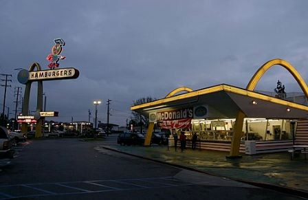
McDonald’s golden arches logo first came around in the 1960s, as a result of their goal in simplifying the logo and branding the business. Its design reflected the look of the physical restaurants, and since became the main imagery of the world’s most famous and largest fast-food restaurant chain.
Target
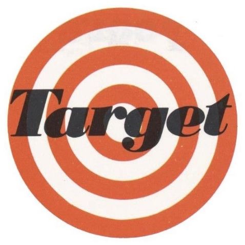 Target opened its first store in 1962 in Roseville, Minnesota. Befitting its company’s designation, the logo featured a bulls’ eye with five rings and its italicized name in the center.
Dunkin Donuts
Dunkin’ Donuts’ first logo came in the 1950s in the same year it was launched, featuring cursive writing of the company’s name in dark red color. A decade later it started using the now-familiar hot pink color, which then became the iconic shade of the business. The 1960s design also came with a “cup” to highlight that the quick-service chain also offers coffee.
Pepsi
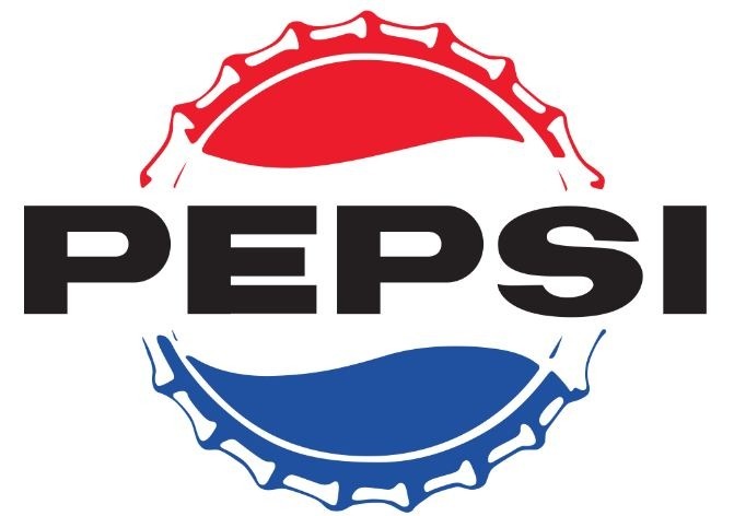
Pepsi is perhaps one of the most dynamic companies when it comes to logo design, having employed various changes since its creation in 1898. In its early design, Pepsi Cola used red text and a white backdrop. It was in the 1950s when it started using its iconic colors: red, white, and blue, and the bottle cap. Yet, it was in the 1960s when it dropped the “cola” and began using just Pepsi. The new design also brought a modern, symmetrical, and minimalist feel to the logo, which targeted the young generation of that time.
GAP
The world-renowned American clothing and accessories retailer GAP, featured a lowercase sans serif font in the 1960s, in contrast to its all-caps font today. It also came with the “The,” which has only been dropped in 1986.
IBM
Another company that embraced reimagination in terms of logo design is IBM since its foundation on June 16, 1911. Its logo underwent various changes but it was in the 1960s when it landed its most iconic logo. Designed by Paul Rand, the logo featured the blue bold block letters it started using in 1946, but the 1960s design came with 13 horizontal stripes (later on changed to eight stripes), which IBM said to imply speed and dynamism.
Burger King
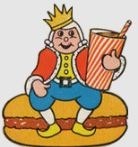
Though it was first used in 1957, the logo used by Burger King in the sixties showcased an actual “King” mascot sitting atop a burger while holding a drink. It was the company’s first and only logo that featured the image of the royalty and phrase “Home of Whopper,” before mainly using the company’s name sandwiched by two buns.
Walmart

Walmart opened its first on July 2, 1962, in Rogers, Arkansas. Its first logo was pretty modest, spelling the company’s name, coming in all caps and in blue font color. Two years later, it introduced its true official logo, “Wal-Mart” written in black font and frontier. It has been used by the company for nearly 20 years, alongside a “Discount City” mark that appears on print ads, uniforms, and signages.
Oreo
Oreo, the world’s most famous chocolate sandwich cookie, was launched in 1912. Since its inception, its logo underwent various changes, first using the color green as its main color. It then used yellow and red before sticking to its emblematic blue color in 1952. In 1960, the company’s logo threw a cooler, more contemporary design, with a vivid blue background, and four circles with each containing “Oreo” letters, divided by white vertical lines.
Taco Bell
Established in 1962, Taco Bell’s logo was composed of Mexico’s flag colors, red, yellow, green, and orange – colors also suitable for fast food restaurants. The design featured a distinctive horizontal blocky wordmark with a color scheme, seemingly dancing or flowing in style. The resulting logo looks delicious and became Taco Bell’s iconic emblem until the dawn of the next decade.
Takeaway
That’s the rundown of some of the most iconic logos from the 1960s. Today, some of these had elements of their past, while others opted to employ new designs. It’s no surprise given that companies need to make necessary adjustments through time to keep pace with the bigger competition and significant changes in the modern world. Who knows what more exciting and creative things we’ll see in the face of business logos? Only time can tell, but all are undeniably worth seeing.