
The Rolling Stones’ tongue and lips logo is one of the most iconic symbols of rock and roll. Known across the globe, this emblem isn’t meaningful to just rock and roll fans, but it has also become a powerful fashion symbol. Like other famous logos , this design has taken a life of its own. Many people are buying apparel or other merchandise featuring the logo without any knowledge of the band it represents. Moreover, the Rolling Stones also created songs especially for those fans who love to gamble in casinos such as the hit Tumbling Dice Song.
Let’s take a closer look at the story behind the famous logo:
History of the Rolling Stones Logo
Otherwise known as the tongue and lips logo or the Hot Lips logo, the Rolling Stones logo is eye-catching and deeply meaningful. Designed by John Pasche for a meager £50, it stands out as the symbol of rock and roll enthusiasts and wild party animals alike.
It all started when the Rolling Stones needed a poster for their 1970 European Tour. They were unhappy with the designs offered by Decca Records, their record company at the time. The band began looking for a design student who would design not only the poster but also a logo or symbol that the band could use on a program cover, note paper, and cover for the press book.
The band looked for an artist, so they contacted the Royal College of Arts in London for recommendations, and the college put them in touch with John Pasche, a graphic artist, who was then on his third and final year on his Masters of Arts degree. Jagger has already seen some of Pasche’s designs and decided to give him the gig. The band called the college, and he accepted the commission.
In 1970, Pasche set up a meeting with Mick Jagger to discuss ideas for the poster that had nothing to do with the current tongue and lips logo design. A week after meeting, Pasche sent the tour poster he designed to the Rolling Stones, but Jagger wasn’t satisfied and turned it down. Pasche thought that the initial rejection was the end of it, but Jagger asked him to revise, saying John could do better.
Jagger then accepted his second and final revision. The letter confirming the official commissioning for the band’s logo was dated April 29, 1970. Pasche met with Jagger again shortly to discuss details.
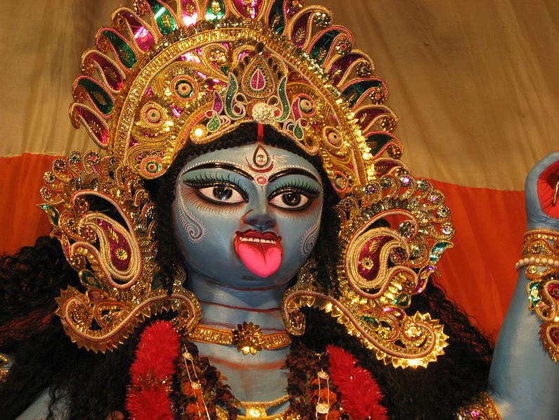
For the logo, Jagger suggested a simple logo that will stand the test of time. Jagger showed an illustration of Kali, the Hindu goddess of Death, whom he had felt inspired by that time. The illustration showed the characteristic features of the goddess, which included an impressive mouth and a pointed tongue sticking out. The design concept represented the band’s anti-authoritarian attitude.
While most people assume that the inspiration for the logo came from Jagger’s mouth, Pasche didn’t have that in mind until further along while he was designing, and he realized that a connection could be made there. The logo also has sexual connotations that can remind one of the irreverent freedom of the counterculture. The resulting tongue and lips logo first appeared on the band’s 1971 album, Sticky Fingers, and it has remained ever since. In a 2015 interview with the New York Times, Pasche stated, “I didn’t want to do anything Indian because I thought it would be very dated quickly, as everyone was going through that phase at the time.”
The band him a mere £50, which was nothing compared to the ridiculous amount of money that has been made from that logo.
When the band needed to arrange the art for the Sticky Fingers album, they needed to finalize the logo for the US version of the record, and they were short on time. The version that had been faxed over to New York did not have high enough quality to be used realistically, so Craig Braun, owner and director of Sound Packaging Corporation, ended up re-drawing the logo.
Braun’s version of the logo modified the tongue, making it more narrow, and added a second white line. Then, he drew a more prominent black outline on the tongue, reshaped the teeth, and deepened the black void at the back of the mouth. This version of the logo was seen on the US vinyl and is the version that the Rolling Stones opted to use as their official logo, of which many variations have been made. Braun’s version was used for the tours, licensing, and merchandising.
![]()
Meanwhile, while Pasche was paid just £50 in 1970 for the logo, he was paid a further 200 in 1972. Then, in 1984, he sold his copyright of the logo to the Rolling Stones’ commercial arm for £26,000. In 2008, the Victoria and Albert Museum in London bought Pasche’s original work for £92,500.
Another version of the design dates back to 1971, which was made by artist Erni Cefalu. During that time, Cefalu had been working under Craig Braun at Sound Packaging Corporation. He also created a variation of the original design, which was called the “Licks” logo. This version of the logo was included in an ad taken by Craig Braun for his “Rockcreations,” launched in the 1971 issue of Rolling Stone magazine. Though Cefalu’s version was not used in its exact form in many of the official merchandise and licensing of the band, he certainly contributed to the mythos surrounding the logo.
Since 1971, some form of the famous tongue and lips logo has been a part of every single music release, official statement, or poster from the Rolling Stones. They even decorate stadiums and construct stages with the tongue and lips design – the biggest being the Super Bowl Halftime Show in 2006.
![]()
During the band’s 50th anniversary in 2012, the Rolling Stones commissioned graphic artist Shepard Fairey to design an updated version of the iconic logo. Fairey was the artist behind the famous Obey Giant street art series and Obama’s Hope poster.
After drummer Charlie Watts died in 2021, the logo was changed to black for the No Filter Tour in his memory.
Bottom Line
Regardless of their feelings about the band, many generations have seen the opportunity to be rude and bold using this logo and wore this as an icon of their own rebellion. The sexual nature of the design is also an emblem of the sex, drugs, and rock and roll lifestyle.
Is Rolling Stones and rock and roll your style? Incorporate their music when picking party music