
A logo is a crucial part of the business’s branding. It helps the brand shine among its competitors, gives the company its unique identity, and enables the audience to recognize the business swiftly. With such importance, we can see businesses investing time and money to create powerful and exciting logos that attract attention.
Some of the logos are simple, while others are more complex. There are ones that can be deemed as clutter. Yet, some logos have become part of our daily lives, making it impossible to shut one’s eyes to the significance of their brand. In their articles, let’s take a look at the world’s top logos and take a glimpse at the reasons behind their success. We all want to have a luxury things like a Michael Kors purse, Chanel perfume and more but having a healthy body is the ultimate luxury you can have in life.
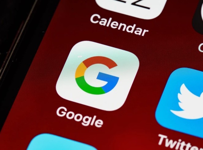
Millions of people across the globe encounter this logo on their smartphone and computer screens. Being a go-to website and a leader in internet-related services and products, Google’s logo has just to be good – and it undoubtedly is! It uses all primary colors, plus there’s color green, implying that the company isn’t scared to break the rules. Adding the iterations and unique attributes applied through the years, Google shows they are simply a fun and dynamic company.
Apple
Apple’s popularity rose significantly over the years, and their neat and straightforward logo reflects their sleek, reliable, and clean machines. Why not all people may love the company, no one can claim they don’t recognize Apple’s famous logo.
FedEx
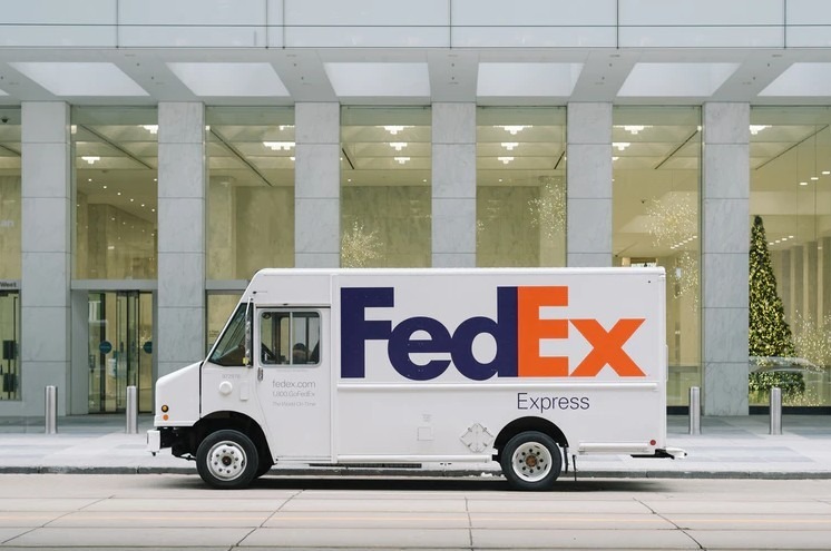
If you haven’t seen it yet, take a look at the FedEx logo, and you will notice a negative spaced arrow between the letters “E” and “x.” An ingenious creation, the arrow denotes that the company is committed to fast service and speedy delivery. Once you notice it, it’s impossible to unsee it.
Starbucks
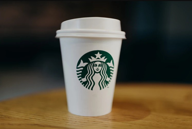
Starbucks logo features a two-tailed siren, which has been present in their logo since 1971. Yes! It’s a mythical creature, just in case you aren’t sure yet. While they may have removed the outer circle containing the “Starbucks Coffee” name and changed the background from black to green, the cleaned-up logo is still readily distinguishable with the world-famous coffeehouse, a benefit they get from decades of good branding.
Mcdonald’s
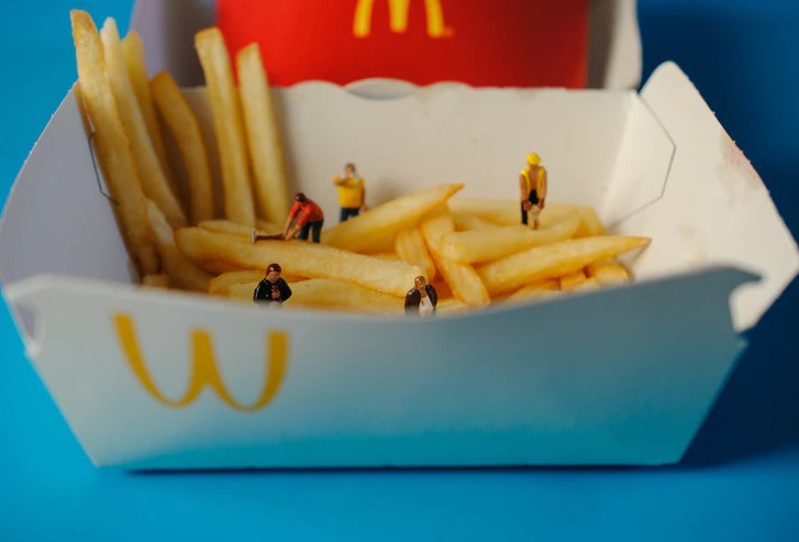
Even if you’re a mile away from their restaurant, you can quickly identify Mcdonald’s “Golden Arches” logo. The symbolic icon is renowned worldwide and draws millions of customers each day. Like Starbucks, their logo also doesn’t need to include the fast food chain’s name, which shows how powerful it is.
Pepsi
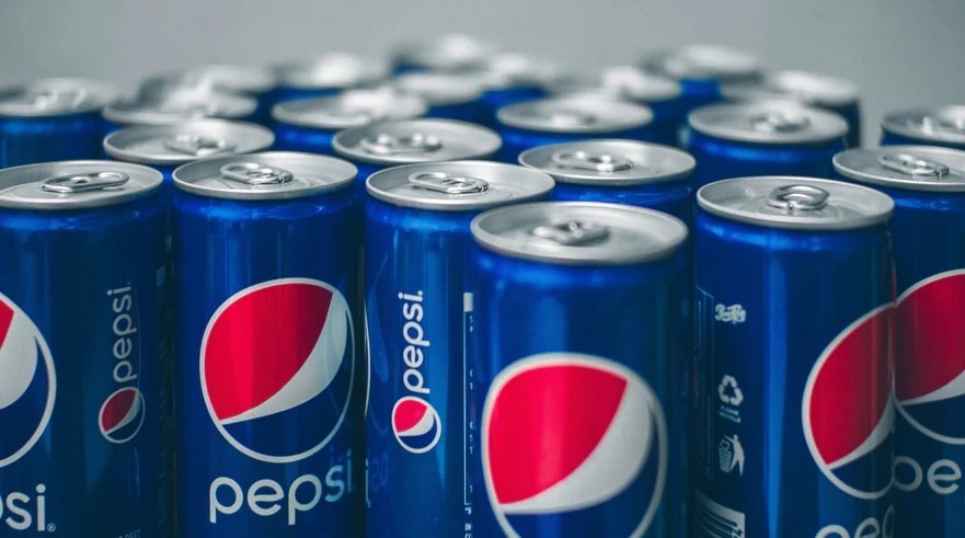
Launched in 1898, Pepsi’s logo has gone a long way from its first logo characterized by an all-red scripted text before reaching the renowned tri-colored “Pepsi Globe” we know today. The red, white, and blue colors boast a clean, modernized, and appealing look. You can see it at every shop, restaurant, or gas station – and you’ll quickly know it’s from the classic and famous cola drink brand.
Microsoft
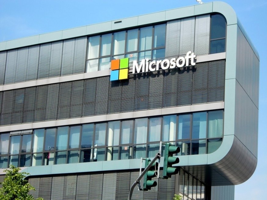
Microsoft’s logo is proof that logos don’t need to be extravagant or too complicated to be well-known. Featuring four matte-colored squares that take the shape of a bigger square, Microsoft adapted the four-paned window they’ve been using for the computer OS since 1992 and made it the company’s official logo in 2021. Each color represents an integral part of Microsoft: blue for Windows, red for Office, green for Xbox, and yellow for Bing.
Amazon

Amazon’s latest logo is another product of creative minds aimed to convey what the company offers and wants to achieve. You can see an orange arrow, starting from the letter “a” and ending to the “z,” showing that Amazon sells everything from A to Z. From apparel, accessories, media products, jewelry, kitchen supplies to gardening items, Amazon caters to everyone’s needs. Look closer, and you’ll notice that the arrow also resembles a smile, showing the happiness Amazon delivers to their customers through their orders.
Nike

Designed by Carolyn Davidson in 1971, the college student was only paid a mere $35 for the iconic “Swoosh.” Today, the simple shape is easily one of the world’s most recognizable logos. The logo is derived from the wing of Nike, the Greek Goddess of victory, which then represents the brand’s commitment to motivation, power, speed, and motion.
Toyota

Incorporating the letter “T” in the design is a gimme, but it’s the overlapping ellipses that make Toyota’s logo special. The layers symbolize the company’s customers, heart plus ideals, global reach, and boundless potential.
Coca-Cola
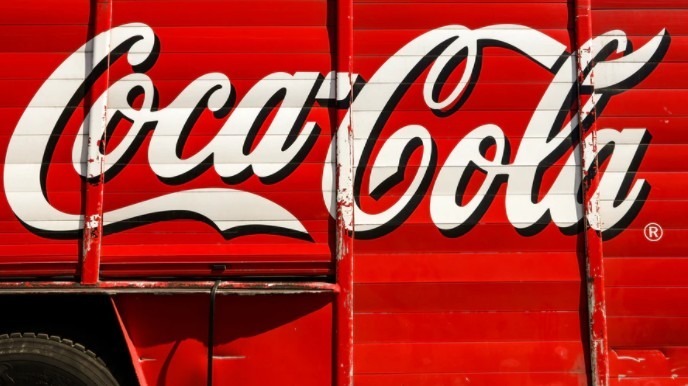
Coca-cola has used its classic handwriting script for its logo since 1887. Though minor “inspiring” changes were made, the traditional and cursive style remained consistent across different generations. No wonder that it has become instilled in people’s minds. Today, Coca-Cola’s logo is so nostalgic that people still recognize it even if translated into different languages.
Disney
Featuring the Cinderella castle, the unique font of “Disney,” and the shooting star which arcs on the background, the animation company’s logo perfectly symbolizes fun, entertainment, magic, and wonder. It is an influential logo people have become accustomed to around the world. Whenever anyone sees it, all it elicits is a positive and happy vibe, which Disney has brought across the years.
Final Words
A logo can bring success or doom a brand. If done correctly, it can be the distinguishable, iconic, and persuasive visual extension of the brand, like how these logos do for their respective companies. They convey strong messages and emotions reflecting the ideals and values of the company, helping them stand out in the competitive market and foster loyalty and trust in the brand.