
Suppose you are heading down to buy a toolset as a newbie. You’re surrounded by shelves filled with various options, each promising to be better than the next. While trying to choose the perfect set of tools for your latest DIY project, the first thing you’ll probably notice in any toolset brand is the logo.
The logo is essential in this modern era as it has several purposes: it acts as a call to action, creates a lasting impression, serves as the cornerstone of your brand identification, sticks in consumers’ minds, helps you stand out from the crowd, and encourages brand loyalty.
Particularly, for the case of a toolset brand, logos are significant. The toolset brand’s logo gives away an image about innovation and cutting-edge technology. Besides, it can also depict focus on tradition and craftsmanship.
Moreover, a professionally created logo establishes credibility by demonstrating your competence and encourages visitors to linger around. It introduces you to potential customers, details your services, and explains to them how you can help them. It tells those who are unfamiliar with your company that they can trust the quality of your services. In this post, we’ll have a look at some top toolset brand logos and how each brand associates it with their success and quality.
Brand 1: Craftsman
Craftsman is a brand of work clothing, garden and lawn tools, and complete toolset kits. The company is known for different other products as well, such as hand and power tools, tool storage, automotive tools and equipment, and more.
History and Background of the Brand
The brand was founded in 1927 by Sears, Roebuck and Company, an American retail company that was once one of the largest retailers in the world. Initially, the company aimed the different types of tools at farmers and mechanics. The company soon started to gain traction for its exceptional quality.
By 1940, the company enhanced the product line and sold Workwear, including coveralls and overalls, under the Craftsman Workwear brand. In 1960, the company introduced its “lifetime warranty” on hand tools, which became a hallmark of the brand. For this reason, it got even more popular all over the United States.
In the 1990s, the company also started manufacturing and selling professional-grade lawn and garden tools, including lawnmowers, trimmers, and leaf blowers. As of 2017, the parent company, Sears, sold the brand to Stanley Black & Decker company.
Since the formation of Craftsman, the company has gone under rebranding and changed its logo multiple times with the logo given below still being used.
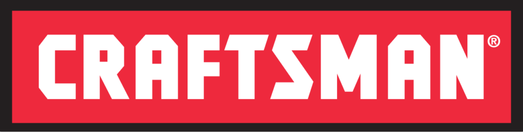
Analysis of the Logo Design
The word “Craftsman” is spelled out in a tool-like font, with all the letters in white against a red background. The font is simple and clean, making it easily recognizable and easy to read from a distance. The red background provides a bold and eye-catching contrast to the white letters, making it stand out on the shelves and marketing materials.
Many iterations of the Craftsman logo have appeared over the years. Yet, the trademark red hue and tool-like font have persisted as enduring features of the product’s visual identity. The red Craftsman emblem has become a trusted icon in the DIY community.
What the Logo Indicates About Craftsman’s Values and Products?
The Craftsman logo is a mark of reliability and superior workmanship. The bold and clean font signifies strength and reliability, suggesting that Craftsman tools and workwear are tough and durable.
The logo’s red hue is commonly linked with power, strength, and durability—all of which are crucial for construction work and home renovation. It’s a symbol of perseverance, a focus on excellence, and a determination to ensure complete client satisfaction. When you see the red Craftsman logo, you immediately think of quality and reliability, which is why it was chosen as the company’s official color.
One of the main aspects about this logo is that it has undergone few major changes. Therefore, the logo’s consistency over time suggests that Craftsman is a brand that has stood the test of time and continues to be a reliable choice for consumers.
Brand 2: DeWalt
From the construction industry to the woodworking industry, DeWalt has you covered with its range of power and hand tools.
History and Background of the Brand
The company’s roots may be traced back to 1922, when Raymond De Walt developed the first rotary saw, setting the bar for competitors. Since then, the company started selling different types of woodworking machinery as well. By 1941, the company was able to introduce its first portable electric power tool, the radial arm saw. This tool was a remarkable invention and was one of its kind back then.
However, the company transformed during the 1960s, an era in which DeWalt started selling drills, sanders, and grinders, for both professional and home use. From this time, it got more recognition and emerged as a trusted brand for different types of tools.
In the 1990s, the company underwent 2 major changes. Firstly, it was acquired by Black & Decker, which opened up new marketing possibilities for the firm. Secondly, DeWalt introduced its range of cordless power tools. These tools got popular due to their ease of use, especially by homeowners and “DIYers”.
In the 21st century, DeWalt continues to be one of the top tool brands in the world, focusing on excellence, quality, and consistent innovation. Since the company’s formation, the logo has been changed several times.
Analysis of the Logo Design
The typography used in the original DeWalt logo was both distinctive and symbolic. Although the present logo has a more generic appearance, it is cleaner and less complicated. The current DeWalt logo features a bold and modern design with a distinctive yellow and black color scheme.
The logo consists of the company name “DeWALT” in bold uppercase letters, with the “D” and “WALT” capitalized and connected by a stylized yellow crossbar. One reason why the current logo is more suited to the brand is because the color yellow is often used in the construction and home improvement industry, such as hard hats. DeWalt has also positioned itself to be the right brand in the construction and home improvement industry with its wide variety of tools.
It appears like the current black and yellow color scheme is more easily recognized than the old emblem’s red. The use of red helped to communicate authority. But the black and yellow also serve this purpose admirably and contribute to an eye-catching logo.
What the Logo Indicates About DeWalt’s Values and Products?
The logo for the power tool manufacturer conveys the company’s commitment to quality, durability, and functionality. The yellow represents energy, power, and efficiency, while the black conveys strength and durability. In a nutshell, the logo is a representative of the brand’s values and the idea that DeWalt is developing cutting-edge power tools and equipment.
Brand 3: Milwaukee
![]()
Milwaukee is a well-known brand of power tools with manufacturing facilities in the United States, Europe and China. The company was established in 1924 and has since been a prominent name in the manufacturing and sale of a diverse range of power tools, from hand saws to digital meters.
History and Background of the Brand
Milwaukee was founded by Wisconsin by A. F. Siebert, who previously worked as an engineer for Henry Ford. The company was formed with the aim of making power tools that can be used for heavy-duty purposes. In the early years, the company’s main focus was heavy-duty tools. However, in the late 1950s and early 1960s, Milwaukee started the production of a wide range of power tools, including saws, grinders, and sanders.
What can be called a real breakthrough for Milwaukee is the era of the 1980s. Milwaukee introduced several groundbreaking products including Hole-Hawg drill, Sawzall reciprocating saw and others that helped to establish the brand as a leader in the power tool industry.
In 2005, the company was acquired by Techtronic Industries. Since then, the brand has continued to innovate and invent newer and better products. Brushless motor tools, fuel lines, and One-Key systems are just few of the many newer add-ons to the existing products by the firm. Milwaukee is also having its own research and development center for future innovation.
Today, Milwaukee has established itself to be one of the most reliable power tools brands. Be it the need for a regular home tool, or dealing with a modern sewage system, Milwaukee is sure to have something appropriate for your requirements.

Analysis of the Logo Design
Unlike all the other tool-manufacturers, Milwaukee has a unique logo, with a bit of funky element added to the font making it visually different and appealing.
The original Milwaukee logo featured the company name in a cursive font with the tagline “Heavy Duty Power Tools” written underneath. However, it was changed several times later. The current logo of Milwaukee has a striking and modern graphic identity. Its logo is a stylized word mark that looks both modern and imposing in a bold red tone, making it easily recognizable.
The company’s color scheme is predominantly red and white, which appears in both reversed and reverse-aligned forms. Both designs exude confidence and strength, showcasing the boldness of the brand as well as its commitment to change and development.
The label’s logotype is a bespoke script design with geometrical forms and strong strokes. The letters are skinny and confident looking. The logotype font was inspired by the Millie Bold font, but its lines were smoothed out and updated. The logo’s flashlight underlining was balanced by the “M’s” long, pointed tail, which also lent the design a sense of sharpness and force.
What the Logo Indicates About Milwaukee’s Values and Products?
The logo hasn’t changed much over the years; it consists of the firm name in slightly diagonal letters to convey a sense of forward movement and technological improvement. The bold, industrial lettering conveys a sense of strength, durability, and reliability, which are all key attributes of Milwaukee’s power tools and equipment. Strength and power are represented by the flashlight icon beneath the wordmark, which also stands for the bravery and dependability of the company.
Brand 4: Makita
![]()
When it comes to producing power tools, Makita is one of Japan’s earliest and most venerable brands. It has been around since 1915, and it still holds the majority of the market share in the power tools segment. The company has factories and warehouses all around the world, and its cordless power tools are particularly well-known among professionals and DYIers.
History and Background of the Brand
Makita Corporation was founded in Nagoya, Japan, in 1915 as an electric motor sales and repair company. As the company started to gain success, it expanded the product line. The major improvement in the brand was post 1950s when Makita started manufacturing electric planers as well as producing the world’s first rechargeable power tool, the 6500D battery-powered drill (1970).
By the 1980s, it established itself as a leading power tool manufacturer in Japan and was expanding globally. Towards the end of the 20th century, Makita became a market leader in the power tool industry with subsidiaries and manufacturing plants globally.
To this day, Makita continues to provide top-notch tools. Its history is intertwined with the development of power tools, thanks to the company’s dedication to staying in close contact with its consumers.
Makita’s logo hasn’t changed much over the years, and the business still uses the same bold white and red color scheme. The connotations of perfection, fortitude, and advancement are spot-on for the brand; they capture the essence of the company and its goals clearly.
Analysis of the Logo Design
The Makita logo consists of a stretched red rectangle with white, stylized lettering at its bottom edge. The distinctive elegance of the letterforms and the vividness of the emblem’s color scheme strike a nice balance with relative spareness of the composition. Makita’s primary brand color is the vivid red, from which the company’s logo draws its inspiration.
Makita is written in a special cursive font that looks like Japanese calligraphy. Their soft, arcing bottoms offer a nice counterpoint to the sharp corners and square centers of the letters and the components. The first letter, an “M,” is visually intriguing since the two horizontal bars atop its vertical shaft are at varying heights, giving the impression of a set of stairs. The font is Aromaboy Regular, which is quite close to the rare Makita typeface.
What the Logo Indicates About the Matika’s Values and Products?
The color palette of white and red is very prevalent for Japanese brands since it is a theme of the official Japanese flag, a salute to the rising sun, and a tribute to the customs and roots of the country. This design conveys a sense of modernity and sophistication, which reflects Makita’s commitment to staying ahead of the curve and delivering products that are on the cutting edge of technology. The color combination speaks a lot about the progressiveness, enthusiasm, and professionalism of the business, as well as its dedication to its patrons.
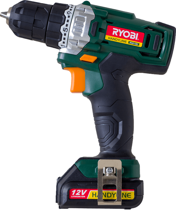
Brand 5: Ryobi
![]()
RYOBI, one of the largest and most inventive producers of power tools and outdoor products, is known for its dedication to lowering the price of professional-grade tools without sacrificing quality. This is why RYOBI is the go-to brand for so many people in the DIY, woodworking, hobby, craft, and gardening communities.
History and Background of the Brand
The company was founded in 1943 and initially produced die-cast products for the automotive industry. In historical context, Ryobi Seisakusho Co., Ltd. was incorporated as a privately held firm in 1943. Almost 2 decades later, in the 1960s, Ryobi began manufacturing power tools. This name was officially adopted in 1973. By the 1980s, they had established themselves as a major player in the industry.
Today, Ryobi Limited has grown to become a major player in the Japanese auto parts, telecommunications, and electronics markets. There have been several innovations by Ryobi such as the 18V Lithium-Ion battery for power tools produced in 2005. In 2010, the company also formed the Tek4 line of cordless tools, featuring a lightweight and compact design that used a universal rechargeable battery.
Analysis of the Logo Design
There is no clear connotation between the company’s logo and the sectors in which it operates. Yet, Ryobi’s concept is represented metaphorically in the design. In contrast to the conventional sans used for most of the letters, the “R” and “B” possess unusual spacing that gives them a modern look. The designers settled on a striking shade of black and white. However, the main background theme of Ryobi is Fall Out Green. The green color used in the background of the logo is associated with growth, vitality, and nature.
The corporation uses both a wordmark and an icon. It is a tiny variant that is suitable when there is insufficient room for the entire Ryobi logo or when the proportions prevent utilizing a long version. A white “R” is enclosed by a black square in the icon. This creates a strong visual association between the icon and the primary wordmark.
What the Logo Indicates About the Ryobi’s Values and Products?
The company decided to use white and black as the primary colors in the logo. It breathes new life into the symbol, lending it energy and enthusiasm. That fits in perfectly with the firm’s dedication to the business and its wide range of service offerings. This tone indicates that the company has sufficient vitality to continue changing for a very long period.
Green background represents the company’s mission to provide people with high-quality goods that enhance their lives and the lives of those around them. The green color used in the logo is still significant, representing growth and nature, which aligns with Ryobi’s focus on outdoor power equipment.
Brand 6: Black & Decker (Black + Decker)
![]()
The Black & Decker factory opened in 1910 in Baltimore, USA. Black & Decker (now Black + Decker) is a major American manufacturer of tools and equipment, supplies, hardware, home renovation items, household appliances, and fastening systems.
History and Background of the Brand
During the 1920s, Black & Decker enhanced the product line to include a range of portable power tools, such as sanders and saws. The brand kept growing at a slow and steady pace and also introduced products other than power tools. By the 1960s, Black & Decker introduced its first cordless drill, which revolutionized the power tool industry. It also went public and the shares were listed on New York Stock Exchange in 1961.
Over the next few years, Black & Decker acquired several other companies as well including Lawn-Boy, Emhart Corporation and Delta Machinery. Black & Decker officially changed its name to Black + Decker in 2010, shortly before its merger with Stanley Works.
Analysis of the Logo Design
The ampersand has been changed to a “+” in the current Black & Decker logo making it Black + Decker, which has orange sans-serif text set in two layers. The characters in the inscription are all written in capital letters and are separated from one another by a significant amount of white space. The same hue of orange is repeated over a frame that surrounds the logotype and is stretched horizontally. The frame’s corners and edges are rounded. The same logo is also available in gray font color against a white background with no orange hue. The gray variant logo is simple, clean, and highly recognizable, with bold black lettering against a white background.
What the Logo Indicates About the Brand’s Values and Products?
Not only does the word “black” appear in the company’s name, but the color black is also associated with strength and confidence, making it a fitting choice for the brand. The color “Orange” is meant to convey the idea that everyone can utilize the company’s wares successfully, regardless of technical ability.
The emphasis on the plus sign in the center of the logo suggests a focus on technology and functionality, which aligns with the brand’s image as a provider of industrial tools and equipment. It also acknowledges the company’s heritage and longstanding reputation for quality and reliability. The thick orange line encircling the plus sign adds a sense of cohesion and unity to the design, suggesting a company that is committed to combining innovative technology with practicality. The logo remains true to its heritage and history. Overall, the Black + Decker logo effectively communicates a message of quality, innovation, and reliability.
Conclusion
From DeWalt’s bold yellow lettering to Milwaukee’s fierce red branding and Ryobi’s vibrant green theme, these logos are designed to communicate key information about the brand’s products and values. All of these companies have conveyed their message in the finest manner depicting the ultimate level of quality, perfection, and cutting-edge technology.
Through careful use of color, typography, and visual elements, these logos communicate a distinct message about each of the brands. Ultimately, it helps them attract the audience’ attention. So the next time you’re working on a project and need a reliable toolset, just remember: when it comes to getting the job done right, these brands have got you nailed (pun intended!).