
Toblerone is not a company name. It’s a chocolate bar made in Switzerland with an intriguing logo history. It exemplifies how a company’s roots may be entwined with its brand.
Contrary to popular belief, Toblerone is not the name of a company. Many people assume that Toblerone is the name of the Swiss chocolate brand that produces iconic triangular-shaped chocolate bars. However, this is not entirely accurate. In fact, Toblerone is simply the name of the chocolate bar itself, not the company that makes it. The company that produces Toblerone is actually called Mondel?z International, a multinational confectionery, food, and beverage conglomerate based in the United States. Despite this common misconception, Toblerone remains a beloved and recognizable brand around the world, known for its distinctive shape and delicious flavor. Switzerland is renowned for its chocolate production; one chocolate bar has a fascinating logo history. This chocolate bar is none other than the Swiss-made delicacy that has captured the hearts of chocolate lovers worldwide: Toblerone. Incorporating a company’s roots into its mark is a prime example of effective branding. By doing so, a company can establish a strong connection with its audience and convey a sense of authenticity.
Since its inception in 1908, Toblerone has become a beloved Swiss chocolate brand that has captured the hearts of chocolate enthusiasts worldwide. With its iconic triangular shape and rich, creamy flavor, Toblerone has established itself as a staple in the world of chocolate confectionery. Its enduring popularity can be attributed to its commitment to quality and innovation and consistently delivering a delectable chocolate experience. For over a century, Toblerone has remained a go-to choice for those seeking a delicious and indulgent treat. The brand has gained widespread recognition for its delectable chocolate offerings, distinctive triangular shape, and one-of-a-kind logo.
The Creation of Toblerone

The history of Toblerone is long but could be more noteworthy. It all started when Swiss businessman Jean Tobler launched his candy shop in Bern in 1868. At first, he dealt with the wares of other manufacturers, but in 1899, he decided to establish his own factory with the help of his sons. He named it Fabrique de Chocolat Berne, Tobler & Cie .
Jean Tobler stepped down from running the family firm a year after the factory’s debut, handing control to his son Theodor. In 1908, Theodore Tobler and his cousin Emil Baumann introduced a unique chocolate in the shape of triangle prisms under the Toblerone trademark. Honey, nougat, almonds, milk, cocoa butter, grated chocolate, and sugar were the original ingredients of a Toblerone.
Toblerone is a combination of two words. The “Tobler” part refers to the surname Tobler. The “one” derives from the Italian term Torrone, which indicates a type of nougat. And the triangular shape of the chocolate was “inspired” by one of the Alpine peaks, the Matterhorn mountain. The Toblerone brand was established in 1909.
The Creation of the Toblerone Logo
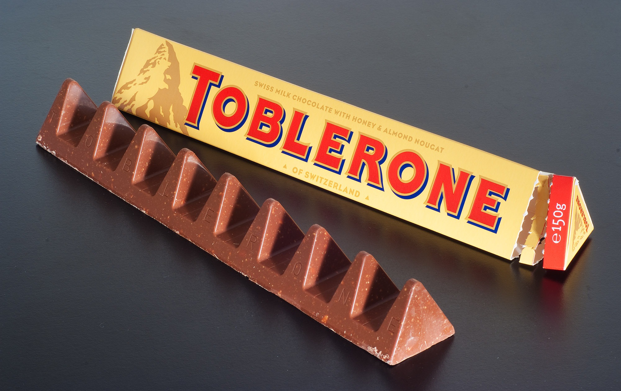
The Toblerone logo is one of the most recognizable chocolate logos in the world. It features a mountain range with a bear hidden in the design. The Toblerone logo has a long and interesting history, dating back to the creation of the Toblerone chocolate bar itself in 1908.
The Toblerone logo was designed by Theodor Tobler, the co-founder of the company, in collaboration with his cousin Emil Baumann. The logo features the Matterhorn, a mountain in the Swiss Alps that is one of the most iconic symbols of Switzerland. The triangular shape of the Toblerone chocolate was also inspired by the Matterhorn’s distinctive shape. The Toblerone logo was first used on Toblerone packaging in 1909. The logo also includes a red and gold banner that reads “Toblerone” and a small bear hidden in the design. Tobler included it in the design because Bern, the Swiss capital where the bar was founded, is known as the “City of Bears,” and the city’s coat of arms features a bear. The Toblerone logo’s meaning pays homage to the popular nutty treat’s homeland. The bear in the Toblerone logo stands on its hind legs and occupies virtually the entire mountain. It is enough to spot it once, and you will always notice it.
The original Toblerone logo featured the Matterhorn and the word “Toblerone” in a simple, sans-serif font. Over the years, the logo underwent several revisions to keep up with the changing times. In 1932, the logo was updated with a more stylized font, and the Matterhorn was given more prominence. In 1959, the word “Toblerone” was made larger and bolder, and the Matterhorn was given a more three-dimensional appearance.
In the 1970s, the Toblerone logo underwent another major revision. The word “Toblerone” was changed to a more modern, rounded font, and the Matterhorn was given a more abstract, stylized look. The overall effect was more streamlined and contemporary, reflecting the brand’s efforts to appeal to a younger, more cosmopolitan audience.
In the 1990s, the Toblerone logo was updated again to incorporate a more dynamic, three-dimensional look. The Matterhorn was given more depth and dimensionality, and the word “Toblerone” was made more prominent. The new logo was designed to convey a sense of luxury and sophistication, positioning Toblerone as a premium chocolate brand.
Today, the Toblerone logo remains essentially unchanged from its 1990s incarnation. The word “Toblerone” is still written in a bold, rounded font, and the Matterhorn still features prominently in the design. However, the logo has been updated with more vibrant colors and more subtle shading, giving it a more contemporary look and feel.
Conclusion
The Toblerone logo has undergone several changes over the years, reflecting the evolution of the brand and its marketing strategies. From its simple beginnings in the early 1900s to its current incarnation as a premium chocolate brand, Toblerone has always sought to stay relevant and appealing to consumers around the world. The Toblerone logo is a testament to the brand’s commitment to quality, innovation, and timeless design.