
Jaguar is without a doubt one of the most well-known brands in the world. Its sleek, powerful automobiles aren’t simply status symbols; they’re also among the best in terms of quality. But, without a fantastic logo, what good is a great brand? The Jaguar logo is unmistakable, it lives so much to the brand symbol as strikingly as its amazing leap. Something about the sight of that big, jumping predator strikes the imagination which explains why it has remained mostly unchanged for over seventy-seven years.
The Humble Beginning: A Backgrounder
Even though Jaguar is a globally renowned brand, it began as a small British automaker specializing in motorcycle sidecars with a completely different name. Swallow Sidecar Company was formed by two bright young men named William Walmsley and William Lyons in 1922. Walmsley chose to sell out in 1934 because he’d had enough of building sidecars. Lyons, on the other hand, saw his products, if not the company, as having a future, Lyons renamed the Swallow Company S.S. after selling shares on the open market. Limited Edition automobile “Jaguar” was first used a year later with the introduction of the SS Jaguar sedan, a joint venture with chassis manufacturer Standard Motor Company.
The company insignia at the time, just like the most iconic business logos in the 1960s, was completely different than it is now. At first, the letters ‘SS’ in a hexagon surrounded by a bird’s wing and tail comprises the symbol until the Second World War, when the SS brand and logo acquired some very negative implications. By 1945, the senior officers at S.S. Cars Limited, grew tired of being mistaken for a completely different kind of SS which is the uprising of the Nazi SS Military group in Germany. He decided to change its name to Jaguar Cars Limited after a general meeting of shareholders. “Not like “S. S.”, the name Jaguar is unique and cannot be confused with any other foreign name,” said William Lyons, chairman, and founder of Jaguar.
The Jaguar Logo’s Inception
![]()
The Jaguar rebranding gave the corporation once known as S.S. a completely new identity. The swallow design was retired in favor of two new emblems: a jumping jaguar and a spherical logo with a jaguar’s roaring visage. The emblem was a hit with fans right away, embodying the same grace, strength, and speed that had made the brand’s automobiles so attractive. The rich history of the Jaguar logo is carved within the records of the famous luxurious brand. The leaping cat has remained mostly unaltered for nearly 8 decades, and with an honorable cause. You don’t mess with a classic, especially when that classic has made your brand one of the most recognized and respected in the world, as the Jaguar executives are aware and live up to its company’s mission.
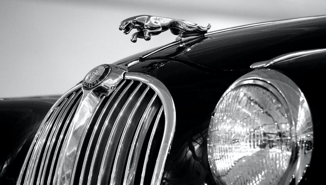
The First Use of the Jumping Jaguar
Jaguar debuted as a model name on an SS 212-liter sports saloon in September 1935. The SS Jaguar 100 was a matched open two-seater sports car with a 312-liter engine. On March 23, 1945, during a general meeting, S. Cars shareholders voted to change the company’s name to Jaguar Cars Limited. The inclusion of the “Jaguar” name and symbol received so much favor from enthusiasts and created a breakthrough for the company’s success that is sustained until today.
The Shade
The jaguar logo, as lovely as it is, would be a very different thing if it were portrayed in startling pink. Fortunately, Jaguar decided to take a more traditional approach to color selection. The exact colors you’ll see depend on where the logo is placed, according to jaguardarien.com: The Leaping Jaguar logo- includes a sleek, snarling silver jaguar animal in mid-leap, and was first launched as a hood ornament before being reconfigured as a badge. A classic combination of silver, metallic gray, and black is expected. Originally, the roaring jaguar insignia was a gold jaguar with a red background and a black border. Since then, it’s been updated to include a circular symbol with a red background, a silver border, and a front-facing silver jaguar animal.
The Importance
Some logos are unclear, allowing customers to put their own spin on whatever the marketing team was trying to say. The Jaguar logo, on the other hand, is a simple design. Even if you try, there aren’t many ways to interpret a jumping, muscular beast, especially when the beast’s name is the same as the company’s name. Jaguars are recognized for their grace, strength, and power and Jaguar cars are no exception. So, there’s no mystery there. But what about the colors picked by Jaguar for their spirit animal? Is there a deeper meaning behind them? You wouldn’t expect a prominent business to pick and mix colors, especially since those same hues will be featured on each one of their super-luxe masterpieces. The silver and metallic colors utilized on the jumping jaguar insignia indicate sophistication and modernity, while the black denotes integrity and performance, according to jaguarmissionviejo.com. The splash of crimson on the roaring jaguar’s spherical emblem, on the other hand, is meant to signify Jaguar’s passion for driving and sports car culture. In that instance, wise decisions almost certainly produce the desired impact.
The Evolution of the Jaguar Logo
Other businesses appear to alter their logos almost as frequently as their product, but with Jaguar, this is not the case. The company’s symbol has remained nearly identical for nearly 8 decades, despite a few small alterations along the way. ‘Unchanged,’ we say, as expressed in-car-brand-names.com, some of the very minor changes that eagle-eyed Jaguar aficionados may have noticed over the years include the replacement of the chrome-plated Jaguar hood ornament with the growling face of a jaguar on the front grill apparently, the hood ornament was causing the health and safety brigade too many concerns to survive the 2000s and a slight revision of the leaping jaguar in printed media to change it but changes or no changes, the logo is still readily recognized today as the same emblem that was created in 1945. Longevity isn’t always a measure of greatness, but as we previously stated, you don’t mess with a classic, which the growling jaguar most certainly is.