

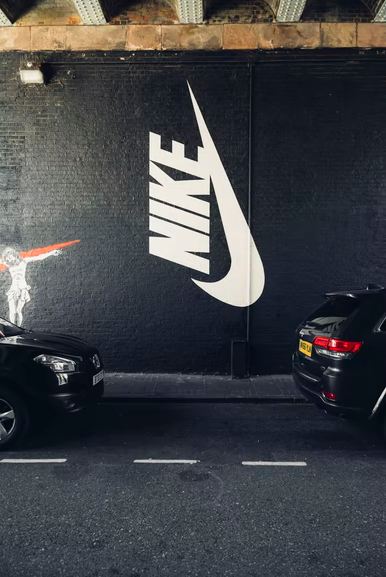
Have you noticed that you can immediately identify a company by its logo, even if its name is not part of the logo? A logo is one of the biggest chunks of branding investments a business can make. We’re all familiar with the Nike logo. With a net worth of 30.44 billion U.S dollars, it is one of the best-known athletic brands in the world. Nike’s simple and elegant swoosh has taken the world by storm in the creative world of design. The notion behind this swoosh is thoughtful. Nike’s founders wanted something that would portray their brand’s image in a simple yet graceful fashion. This swoosh speaks about the brand’s movement and dynamics. One must think that this iconic logo of all time, Nike swoosh, which alone has a worth of 26 billion U.S dollars, must have cost the founders a fortune. In fact, the logo cost only $35. Here’s your guide on how a logo worth less than $50 evolved through the years.
Creation of the Logo
The creator of this billion-dollar swoosh was a graphic design student at Portland State University looking for some extra money. In 1969, she came across Phil Knight, who was an assistant professor back then. Bill Bowerman, who was a track and field coach at the University of Oregon, founded a sportswear company named Blue Ribbon Sports. Knight knew Davidson, who was looking for extra cash so she could take oil painting classes. So, he asked Davidson to help him out and offered him $2 per hour. The company’s earliest logos featured its original name, “Blue Ribbon Sports.” The text was placed under the interlacing symbol “BRS.”
Knight asked Davidson to create some logo designs. He was specific in what he wanted and told her to come up with a stripe or an image that could go on the side of the shoe. She came up with the Nike swoosh, a fluid shape representing speed and movement. The logo resembled the Greek Goddess of victory named Nike. That’s where the brand name originated from. Davidson sold the logo to Knight for a mere $35. Knight didn’t like the logo at first, but then he chose to keep it. Knight said it might grow on him; he then launched his brand with the new logo that became one of the greatest logos in the world.
Nike Logo Design Elements
Like many minimalist logo designs, Nike’s swoosh has stood the test of time. It’s timeless, elegant, and simple to understand what it stands for. Its design elements include:
Shape: The logo’s shape is a fluid check mark representing the Greek Goddess of victory, Nike. Carolyn said she wanted to mimic the wing of the goddess. Although, many people see it as a general swoosh and are unaware of the meaning behind it.
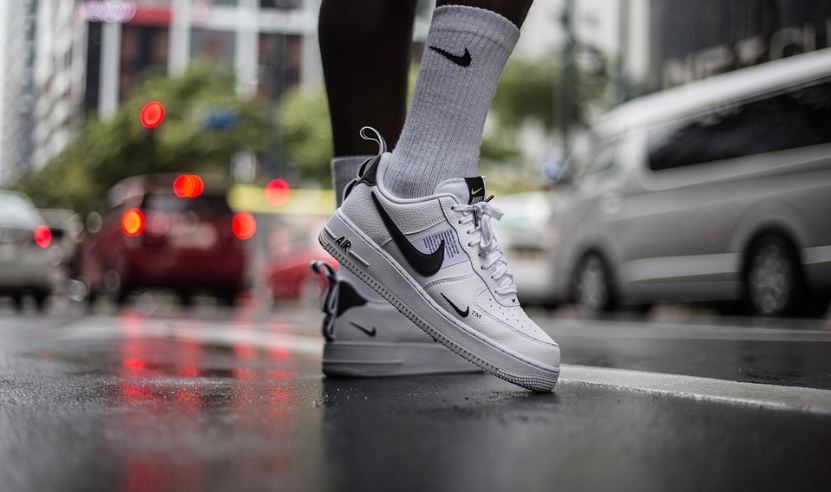
Color: Nike logo has come out in various colors. Red and white are most associated with Nike. Red has the longest association with Nike. Red exemplified passion, energy, and joy, while white represented nobility, purity, and charm. Today one can imagine the swoosh in a variety of colors.
Font: Nike has different variations of its logo and font, and they aren’t always connected. The logo is occasionally seen with the Nike font or the motto “Just do it” displayed on Nike assets. The text uses Futura Bold Font, while the name Nike always comes in bold uppercase letters, emphasizing the brand. The “K” in the Nike is slightly slanted to make it stand out.
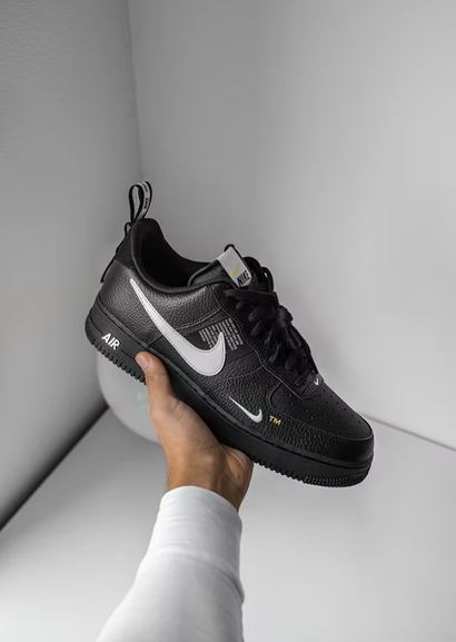
Additional Logos: Nike sometimes also creates separate sub-logos for other specific product lines. For instance, Nike skateboarding puts its initials “SB” under the swoosh while Nike air uses the text “Air” under the swoosh.
Evolution of the Logo

The Nike swoosh wasn’t the logo the company started with, neither the brand name Nike. The brand and the logo went through their fair share of changes.
In 1964, the brand we all know today as “Nike” was called “Blue Ribbon Sports.” Back then, the company’s logo was a set of interlacing initial letters of the brand name “BRS.” The brand name was written underneath the logo. The logo had legibility issues and wasn’t the best in the market, but it served the company a few good years.
In 1971, the Nike swoosh was created by this graphic designer who was just at the start of her career. She proposed the standard swoosh with a few other designs. This logo launched the career of this young woman, Carolyn Davidson. Although the emblem has changed through the years, the central Nike swoosh has always remained consistent. All the variations revolved around it. Nike experimented with adding the word Nike or the tagline “Just do it.”
After 1985, Nike started placing its logo in a red square using a white swoosh and text. Red conveyed the company motive of passion, energy, and intensity, while white symbolized purity and charm. But the company quickly changed it to a much simpler version.
Today Nike’s logo is as minimalist as it gets. The lone swoosh logo turned out to be the best choice owing it its timelessness, simplicity, memorability, and deep meaning. It holds great heritage and impact and ensures it conveys that to its consumers.
Conclusion
Logos are acknowledged to be one of the strongest weapons in the complex strategy pool of brand communication. The right logo says everything without uttering a single word. Choosing an optimal logo for your brand displays rightfully placed virtue and a set of values of the brand and establishes a connection between the company and its community of consumers.
The Nike logo may have humble beginnings, but that’s what makes it so compelling and exciting. When Knight switched the brand name and logo to Nike and the lone swoosh, it redefined the brand image. The lone swoosh has become a cultural dissemination standing for athleticism, power, fitness, dominance, authenticity, and all other values Knight wished to incorporate into their brand image. Nike’s swoosh defined all those values and turned the company and itself into a billion-dollar matter.